
I'm unsure about the serif typefaces, they seem quite out of place with the concept I'm going for. I think from the client feedback I received, a sans serif would be more appropriate. I think from this selection, Apercu and Roboto are my favourites. Most of the letters look the same, the only deciding factor for me would be the g, as roboto's g doesn't have a counter. That appeals to me because it's less unnecessary detail.
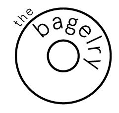
I tried a really simple vector bagel with "the bagelry" underneath in Apercu.

I began to experiment with the layout and type:


On the last one, I tried a wavy line to represent the bagels filling but this idea wasn't really working. I moved on to trying out the bagel characters idea. I used the bagel that I already created and added some eyes and a mouth:

I felt like this was going somewhere. I tried to add arms, but it was really difficult to place them because its a perfect circle:

I removed the arms and focused on the colour instead. I feel like having them as just a face is cuter and less overpowering. I tried a salmon colour:


I feel like this looks much better. I decided to create at least 3 characters and have them on the logo together. I duplicated the bagel I already have, and experimented with 3 different shades. Since the bagelry stock interesting, quirky bagel flavours, I wanted this to be reflected within the characters.

After getting the layout, I experimented with the facial expressions. I wanted it to look inviting and engaging, and give each bagel its own personality.

I gave the bagel on the left some eyelashes and a wide smile, the middle a more concerned look and I kept the expression from the original bagel but made its mouth slightly smaller. Finally, I added a bite out of the middle bagel since it matches its expression:

I sent this version to Rhonda, and she replied saying:
Hi Charlotte,
The characters you have designed are great, they have a Japanese feel and are quite fun.
Keep in touch we are interested in how you get on, send us your blog or website so we can have a look at your work as you progress.
Best of luck with the rest of your brief and your year ahead.
Rhonda & Nat
I feel like theres still room for more development here, and I'd need to mock up the designs on some actual products that could be used in context, but overall I'm happy with this design and it looks like Rhonda is too!
No comments:
Post a Comment