Showing posts with label Study Task 01. Show all posts

Tuesday, 20 October 2015

OUGD503 | STUDY TASK 1 | YAHOO

Study Task 1 involved looking at a previous competition and trying to create a response. We were put into groups and had to re-create the Yahoo! interface. Our initial idea was to create something that would encourage the users to stay on the homepage. As the demographic for this project was 13-18 year olds, we decided that social media would be an integral part of engagement for them. We wanted to keep the actual home page quite minimal, but as you move down, there's some small tabs that show a highlight of your social media accounts. At the top of the page (the small squares) we have News, Emails and Social Media tabs which you can change at any time, and the social media highlights will change respectively to news or email highlights. 


We started to mock up colours, and we initially used the purple from the original logo, but felt it was too dark and not very inviting, especially since we planned on using it as a background colour. We settled on a dark orange for the main colour, and used colour from the respective social media over the highlight.

The orange is a nice contrast with the common blue of social media. When you click on the tabs at the top, e.g. news, the background colour will change, here we have gone for pink:


We also used the slogan "The world at your fingertips", relating to the idea of having everything in one place. The word fingertips comes from the notion that most people in our demographic will be using smartphones and/or tablets, rather than a desktop computer. We also created a mockup of a mobile website:


The next stage in our development would be to create a web browser to compete with other existing brands. This way, the interface would run a lot more smoothly and make everything more streamlined for the user. Finally, we made some billboards for the digital campaign that represent the brands focus on social media:


Monday, 28 September 2015

OUGD504 | STUDIO BRIEF 1 | STUDY TASK 1

For our first study task we were in groups and we had to document on a large sheet what we thought the main stages of the design process was, then create an infographic to showcase this. We decided to take a literal approach to this, starting off with waking up in the morning. We moved onto the brief, which included reading the brief in full and making notes. You should analyse the brief and make sure you know what problems need to be solved.

Once you're confident with the brief, its time to move onto research. Primary and secondary research should be conducted, e.g. questionnaires and reading books/looking on the internet. At this stage it's also important to consider the budget and timescales for the project. This may include speaking with the client and agreeing on deliverables.

After the deliverables have been agreed and signed off, it's time to move over to creating some initial ideas. Sketches, lists, mind maps and discussions are included in this stage. At this point its quite back and forth between the stages as you need to get feedback and develop your ideas. It's important to get feedback from the client and make sure you're designing something that's suitable for the brief.

Once you have a solid idea and feedback from the client, you should start to develop your ideas digitally or physically depending on your approach. Once you have a finalized idea, you should get it approved by the client and start to focus on the production of the design.

Looking back over the budget, you should make sure the stock choices and printing processes don't exceed the set amount. Once a stock and process has been chosen, you can print and present your finished work to the client.

The infographic that we made was quite a linear approach. We included some drawings of what is included throughout the design process, but looking at what other people made, it became clear that sometimes within the design process we need to refer back to stages. Also, people don't do the same stage at the same time, so we should have catered for that within the infographic.


Monday, 9 March 2015

OUGD406 - Studio Brief 3 Study Task - Tower Works

To start off studio brief 3, we were given a 1 day brief in our set groups to come up with a concept and brand identity for Tower Works Leeds.
My group was Me, Polly, Joel, Liam and Paayal (who is away on holiday). Once we were given the brief we first decided to research Tower Works and find out what exactly it was. 

Tower works is an old listed building that used to be a factory, and is now used as office space for creatives. It has big windows and is surrounded by open space, and is seen as a landmark of Leeds. The factory that it once was used to make wire and pins. This is the current logo:


None of the group felt like it was really suitable for Tower Works, it looked very corporate and aggressive with the bold condensed typeface. The type looks separate from the images and there is a lot of wasted space. 

We started brainstorming some ideas and factors of tower works that would be applicable to use in the new concept.  We thought about keeping the idea of the 3 towers, and representing them some way, rather than just having a vectorised image of them. We wanted something that would work in all sizes and would be recognisable. After a while, we came up with the concept of 3. We would use the number 3 in all of our design decisions, for example, the rule of thirds for laying out a website or flyer and the use of 3 colours.
Once we had our concept, we all started drawing down quick ideas and sketches of what we thought was most appropriate. 


 We decided that this design was the most appropriate. It combines the two W's in Tower Works and combines it with the concept of 3. We began to move this design onto the computer and play around with the typefaces.


We felt that this design would look  best with a bold condensed typeface, because of the W being very thin and long. The other typefaces don't really look right with it. We started to develop this design further and add some colours. 


We wanted to include the red-ish colour from the bricks of the building, as it's listed and the architecture is important to our culture. We decided this colour was too red, and changed it to a more burnt orange colour. 


After that, we added a blue to compliment the orange, and decided on a body text:


Me and Polly thought this blue made the overall feel quite masculine, with the condensed typeface and dark colours. We decided to change the blue to a lighter shade, and thought it worked much better:

Once we had a colour scheme we could design the rest of the collateral:


I think that the final solution for this brief is quite effective. I still think that it's bold and quite aggressive, much like the original logo, but now it works better and can be used on a wide variety of things as we have one single logo. Overall I'm quite happy with it, but I don't think it would have been the direction I would have gone with if I was working on my own.

Friday, 13 February 2015

OUGD406 - Studio Brief 2, Study Task 1

Today we were given our first study task for Studio Brief 2. Although we haven't been given the proper briefing yet, this task is directly involved with it. We picked a book at random and had to research it in depth, looking at the context of the book, purpose, audience, when it was published, who by, who wrote it, etc.

My book was Looking Closer 2: Critical Writings on Graphic Design. It was edited by Micheal Bierut, William Drenttel, Steven Heller and DK Holland. This book is the second of its family, and there are 5 Looking Closer books in total. It was written in 1997, so as time progresses, the critical writing may need to be updated or new pieces should be written to keep up with the progress of design. The entire book is a collection of essays and critical writing, profoundly aimed at students, about graphic design. It's a non-fiction book written by professional designers, which will appeal to students as they can take inspiration and read about graphic design in a more academic way. The purpose of this book is to inform and educate within design. 
Since this book was published in 1997, 3 more books from the same series have followed it, so I am unsure of the relevance of it anymore. Most of the content will possibly be out dated. 
The design of the book is suitable for the content as it is heavily text based. It uses flush left on the body which reduces rivers. The rag is also barley noticeable, which makes it easier to read. The headings and sub headings are made clear with a different use of typeface, and each essay is distinguishable as it has a large title and is underlined. 
As this book is about a broad range of subjects from one period of time, it doesn't necessarily associate with one school of design. It has five main sections, including:

Design as language
On teaching and learning
Changing paradigms
Design as strategy
Public works

Within these sections, there are over 5 essays by different creatives on this subject, appropriate to the time period. 

This book was published by Allworth Press, who published the other versions of this book, and also books titled "Graphic Design Time Line: A Century of Design Milestones", "Graphic Design and Reading: Explorations of an Uneasy Relationship" and "Design Literacy: Understanding Graphic Design".

Tuesday, 13 January 2015

OUGD404 - What is a book? Studio Brief 2 Study task 1

Today in Design Principals we had to bring in 3 different types of book and discuss them around our table. I brought in a magazine, my sketch book and my kindle. I thought that these were all very different examples and each had different purposes. 


The magazine that I brought in was Computer Arts November 2014 edition. It was printed on quite thick stock and had a thicker cover. The paper was glossy and had a desirable finish. I think the binding of it was done by glue, though I'm not certain. Its purpose is to inform and entertain creatives, which I think it's done very well with an interesting cover that grabs your attention. 


The next book was my sketchbook. It's purpose is to be a record of drawings, which I think it achieves quite well as the stock is very thick which ensures ink won't run through to the other side. It is spiral bound so the pages can open up and you can see the entire spread, and it's also easy to rip out pages that you don't want.


The final example of a book I brought in was my kindle. I think this is an example of a book as it has digital books stored on it and it shares information and stories. It has no binds or physical pages, and its purpose is to inform and entertain. 

Here are a few examples of what other people brought into the session:


This is a publication in the style of a newspaper that is all about music and current trends. I find it interesting because although it looks like a newspaper, it doesn't look cheap. The aesthetic of the design makes it more desirable, even though it is printed on really thin, cheap stock.


Here is a scratch map, where you can scratch off the places you've been on the map and connect it together with pins and string. I found this interesting as its as  though you make your own story through the map, and maps were once made in the form of a book too.


This is a fiction book that is very thick. It has quite thin paper stock inside so it will be quite cheap to produce. The binding is done by glue. It's purpose is to tell the story and make sense chronologically.


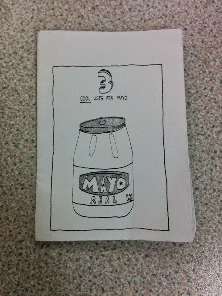
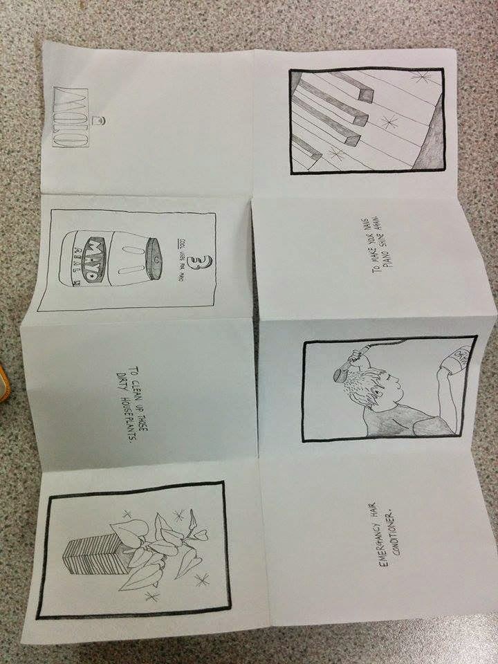
This was a book made from a single sheet of A4 paper using the accordion fold technique. It is a short story about how to use mayonnaise. I think this book is very effective in what it does, and it is very cheap to produce - 1 A4 page. 


This book was made by a series of folds and opens up to be a star. It was made by one of my classmates grandma's, and the purpose was to be sentimental to her. I think its very effective as it opens out and has lots of pictures of her. The stock was quite thick so that it all held together. 

Monday, 1 December 2014

OUGD405 - Study Task 01

Today we were given a study task that involved us re-branding a company and coming up with a concept. We were split up into 10 groups of boys and girls, with only 5 companies to go between us. My group were given Fosters Lager.
We first started off with trying to come up with a concept. A concept is a starting point, that everything can be based off. For example, the Fosters current concept is feeling relaxed and chilling out with a beer. Their tag-line, "good call" resonates this concept, as they are reinforcing that having a Fosters will make you feel good and relaxed.
We had a few ideas but struggled to get something solid. We started looking at Australian culture and how relaxed they are, as opposed to how stereotypical British people are usually quite uptight and stressed a lot. We thought we could portray this by a "relaxing on the beach" vibe, but that idea didn't really work. We also tried thinking of ways we could use negative space, but again, we had no luck.
There were several different concepts that we'd tried, and here they are produced digitally:


At this point we were struggling with ideas. Nothing we had produced had a strong enough concept for us to take forward and develop. We talked to Danny, and he suggested that we just show it how it is, a no-nonsense cheap lager.
We decided to run with that, and develop this idea. We kept the same colour scheme as the original Fosters (Gold and Blue), as we felt that it didn't really need changing, it fits the target audience - adult male, and keeps the identity of Fosters Lager.
We experimented with different colours:


We decided that the paler blue was too feminine  to appeal to the target audience, so we changed it to a darker blue that is more true to the original: 


We also experimented with the addition of a tagline "just lager":


But we decided to keep that out, as it wasn't really working with the rest of the design as it was quite hard to see. We also looked at making half of the O yellow, to represent beer:


Here is our final outcome:


I personally don't like the design that my group produced. It's hard to work within a group with different personalities and design methods. I felt like my ideas didn't really get taken into consideration, but its hard to please everyone when working within a group.

Wednesday, 1 October 2014

OUGD403 - Study Task 1: What's My Type?


Studio Practice Study Task 1 had me thinking about what typeface from a list of 6 best suited my personality. There was a mixture of Serif and Sans Serif typefaces, which included Garamond, Bodoni, Century Expanded, Futura, Times Roman and Helvetica. 

This task was something new to me, looking at typefaces in different ways and looking at the small differences between them was something I hadn't really done before. It was quite difficult to begin with, as I didn't really have any idea of how to justify my choice, though researching each typeface and looking at them all separately has led me to a clear decision.


ABOUT ME: 

- I am happiest when I have great food in-front of me whilst watching good TV.
- My greatest fear is getting lost.
- My happiest memory is getting my picture taken by COW (a vintage shop).
- I can't remember any embarrassing moments as I have repressed all of them.
- Inconsiderate people make me unhappy.
- When I was younger I had a lot of different aspirations, including working in ASDA, being a vet, lawyer and art teacher.
- My favourite hobby is baking.
- My favourite place is anywhere warm and comfortable.

I have come to the conclusion that Futura is the typeface that represents me best. I was originally going to chose a Serif typeface (I don't really like Sans Serif), because I feel that they represent my work and my way of designing as I like detail and flourishes, but after researching Futura I feel its more relevant to my personality. Futura is used in the TV show UTOPIA which is one of my favourite shows. It was also used on the plaque that was placed on the moon. All of the strokes are all an even weight and the lowercase a is not a double story, which reflects mine (and most peoples) hand writing.

The other Sans Serif typeface from the list was Helvetica, and I didn't chose it over Futura because I usually don't like Sans Serif typefaces anyway and I think Futura has had a more interesting history and it fits with me more personally. 

FEEDBACK:

I presented my findings verbally to my group (without a slideshow), but I feel that after watching other peoples presentations mine could have been a bit more engaging. I think using presentation software is useful and having a visual aid can help people interact more with what I'm talking about. I will take this feedback into consideration when I next have to present, and will try and make mine more interesting with the use of software and visual aids. 
I was asked why I didn't particularly like Sans Serif fonts, and I feel that Serif fits me as a designer more. I like detail and put a lot of effort into my work, and Sans Serif looks quite boring to me, although it fits my personality better! 
I think people enjoyed what I had to say, my presentation was quite short and to the point. I explained why I chose Futura and not some other typefaces and how I came to my decision.
Overall I feel my presentation went well but there are still things I can improve on which I will take forward with me.