
I decided that the most effective way to create this logo was to use the two letters together in a bold, sans serif typeface. I started creating my ideas in illustrator, and started looking for a typeface. Looking through, the only one I really liked was Ostrich Sans Black. Its a bold, condensed typeface. I started messing around with the kerning and came up with this:

This was a good starting point. The letters worked well together and I feel like they could work in any colour. I wasn't sure about adding "Get Stuffed!" to the bottom, so I messed around with the colours and composition more:


I really like the white GS!, it stands out from the shadow and the background and you can clearly see what it says. I looked on a website to find complimentary colours for the gold, and got back blues, purples and creams. I think these colours would work really well together and make the brand look of a good quality. I want to create 3 different coloured business cards for the brand in the colour scheme I have chosen. Here are my final colour choices:


I'm happy with these colours and the design, I think they work well together. I'm going to produce all 3 of these business cards for the company in the different colour schemes.
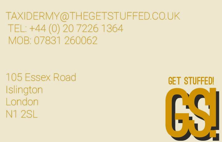
BACK OF BUSINESS CARD:
For the back I was thinking of including their contact details and possibly a tagline produced from the information from their website. I began the layout by gathering the information that I need and placing it in illustrator -

I started by adding the text in the same typeface as the logo and aligning it to the left. I also added the logo again in the bottom right and the company name so people know what it's actually called.
I messed around with typefaces and background colour to see which works best:


I changed the typeface to Roboto Light Italic, as it isn't as condensed and easier to read. It also gives a bit of a break from the logo typeface. I didn't really think the dark grey worked as a background colour, as it hasn't really been used anywhere else. I tried a few lighter shades:


I think these look better, but they are still quite dark. I changed the typeface from italic too, as I think it looks more uniform and professional:

Finally, I changed the background to a more off-white colour, and finished my first business card:
I continued this theme onto the other two:


No comments:
Post a Comment