I got the majority of my research online, as it was hard to find facts and statistics on taxidermy in everyday life. I found it was quite hard to get 20 of each, as there wasn't much information overall. For the words I decided to use special terms used in taxidermy and define them for people who may not know exactly what they mean. I found opinions on taxidermy by asking friends, family and social media. I tried to include a broad range of people within these opinions, looking at different age ranges and gender.
Once I had gathered all of my research, I started to consider how my cards would look. I began looking into taxidermy business cards - as I wanted them to be around that size:

.jpg)


I didn't find any of these designs particularly inspiring, so I decided to look further afield. I came across this poster, which gave off the right feel to it. I wanted quite an old, vintage theme to this work which was portrayed nicely in this poster:

When designing my cards, the first thing I decided to look into was the typeface. I looked at different typefaces, such as:
AFL Font Pespaye Nonmetric

Teletype 1945 - 1985

Telegram
None of these typefaces really felt like they were what I was looking for. They're all too generic and sometimes the slab-serifs are too much. I found a typeface called Nexa Rust and that felt like it was the right typeface:

After choosing my typeface, I decided to work on the layout. I wanted the cards to be portrait, so that the type was easier to lay out and I didn't need any columns. I also wanted some decorative features to make it look more interesting. I found that Nexa also has a symbols pack, so I used that and found that it had symbols of animals on there, which I thought would be great to use for my project:

I thought that these symbols could be used at the bottom of each card, and as there are 4 of them, they could be on the words, facts, statistics and opinions cards - so they don't take any attention away from the images.
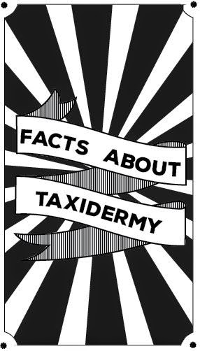
I next went on to create the back of the card. This would be the same for each card, but with different writing, e.g. "Facts about taxidermy" etc. I wanted them to look quite vintage and old so I decided to have them all on black and white. I thought this was a good decision too as most things work well in black and white, but not all the time with colour.
I looked at old style ribbon posters and ribbon vectors to get some inspiration:


I carried this theme onto the other side of the card that displays the fact:

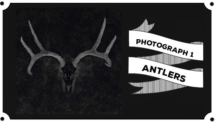

I made the images black and white to fit with the theme, and edited them so they were quite grainy. I liked that they looked quite sinister as it made it look more interesting to look at and showed taxidermy in a different light.
No comments:
Post a Comment