
This was the first design I came up with, it was using the typeface Glamour. I wanted the edges of the letters to cut off the page so that it looks less conventional and more appealing. I used muted purple/blue colours and put all the words on a 35 degree slant. After creating this, I felt like it didn't really convey the type of style that I wanted.
I started again, with a darker background and a simpler sans serif typeface:
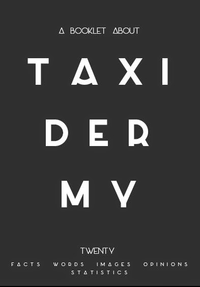
I prefer this design as it is more subtle and I think would draw more people in. The typeface is more interesting as for example the A as a flaccid crossbar. I continued this theme and progressed to make the rest of my book. I planned out the rest of my book and created a contents page:

I used the same typeface as the cover - Azedo, in light and regular. I think this typeface will used as a display for headings and titles. As this typeface doesn't include numbers I used Axis for the page numbers.

Here is my first page, an introduction to taxidermy. I used some of my facts for this, making sure they all fit together and give a brief introduction to taxidermy and its history. I used one central column on each page and left lots of negative space. The lay out is very minimal and gives of the tone of what I wanted to achieve. The body typeface I used is called Slim Joe, and doesn't have any lowercase letters. I think this works as it's very simple, minimal and thin, and I don't think it reduces the readability.

The next double page spread has special terms about taxidermy on it, which were my "words" in the research project. I chose the most interesting of the words which I thought people wouldn't know what meant. I also added the first of my images to the left side page. I added a small border to it so that the image didn't fade into the background and stood out. The background colours on each page are quite contrasting and I think they look good next to each other.

This page is just text, and it was hard to lay out without it looking boring. I think it works with the contrast of the pages and the interesting staggered layout of the columns.

This spread just includes large images just in the middle of each page. I made each background look similar to the overall colour of the image, though I think it may look better the opposite way.

Here is my opinions spread. I included an image to make it look more interesting and had a double column layout on the right page to fit in all of the information but also make sure the columns were wide enough to be able to read the writing effectively.

My final spread is an extra page with "A Few Fun Facts" as the title. I tried to pick the most interesting facts and statistics that I had gathered and included them on this page as extra information. I kept a single central column again and then added an image as I felt I didn't have many images in my booklet overall.

This is the back of the booklet, I chose to add a vector that I created of some antlers, so that it wasn't plain and boring. The colour is the same as the front so it all connects and doesn't look out of place.
Overall I think I have a good starting point for my booklet. I think I'm going to tweak some of the pages and the layout, but I think I will definitely stick with this style.
I have uploaded this version of my booklet to Issuu:
http://issuu.com/charlottewalker6/docs/taxidermy_booklet?utm_source=conversion_success&utm_campaign=Transactional&utm_medium=email
No comments:
Post a Comment