I started looking at colour schemes and using Adobe Kuler online to look at different colour rules e.g. complimentary or triad.
1
2
3
4
I tried to keep them all earthy tones, including blue in all of them. I tried to apply these sort of colours to my designs, and started with the cover.


I first started with a pale blue and orange, but decided that it was too bright. I wanted the colours to be quite subtle. I then changed the Taxidermy to thin, as I felt that was more subtle and looked better. I played around with the layout but decided to start over from the beginning instead of trying to change things that I don't really like.
I played around with the cover for a while, and decided instead of having the whole cover a bright colour, there could be one strip of colour with text running through it. This will be the primary colour running through the booklet. For this, I chose quite a bright turquoise:

I decided to scrap the font that I was working with for the cover all together on my previous attempt and keep it quite simple, using Roboto Light as the running theme throughout. I changed the layout slightly in my final version, putting the text at the bottom so it wouldn't distract from the title:

Since I don't know the layout of my book yet, I've decided to keep the contents page until last. I've saved it a space and will come back later. Next, I decided to do the general introduction to taxidermy page. I'm keeping the same content and layout on most things, but changing the style of the booklet. Here are my developments for the double spread about taxidermy basics:
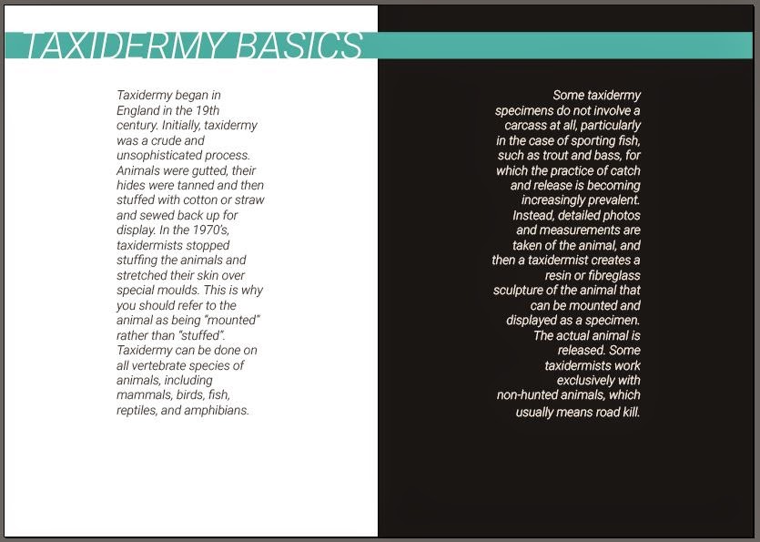
I started with a similar lay out to my previous book, but aligned the text on each side away from the spine. I think this makes the page look more interesting, since there is quite a lot of negative space.

I was happy with the body text but wanted to play around with the title. I moved it to the middle, so that it covered both sets of text, though I was worried about the title being cut off by the printer when it was binded.

I moved the text further apart and changed the colour of "basics" so it matched the background. This is my final layout design for this page, but I went on to develop further to see what I could come up with.

I thought that they could possibly look like two separate titles, so I added a like that joined them together, though this looked a bit unnecessary.

I played around with those lines, making them thicker and adjusting the composition but I think they were completely unnecessary so I removed them and stuck with my final design.
I moved onto special terms. Looking back on the page I created last:

It was quite dark and uninspiring. I wanted to give this page a nice layout with a lot of open space. I decided to start by having the title vertical, and on the left page. I started adding in the text in columns. I added more information in than the last one as I had a lot more room, but realised I only had enough for 3 columns:

I decided to swap the places between the title and the first column, resulting in this:

I prefer this layout as there seems to be less empty space, and I think it would work better in booklet form.
The next page that I'm going to work on is taxidermy facts and figures. I felt like this double page was quite boring in my starting booklet, so I want to make it look more interesting here. I like the layout that I used with the staggered columns, so I started off with that:

I have kept the layout pretty similar to my first booklet, and kept the content the same. I don't think that the grainy images I collected for brief 2 during my research fit with the theme of this book, so I think I'm going to draw some fine liner sketches and scan them in for the booklet or find some better images that suit it from the internet and add them in at the end. I have left a blank page here for any images or sketches I would like to include.
Here is my opinions page that I have made in the same style. It looks quite empty but I have saved some of the space for illustrations or images, mainly the second column on the left page.

I am unsure whether to include the "a few fun facts" page as I did on the previous booklet, as it seemed a bit pointless and there wasn't much information on it anyway. Overall I'm pleased with the progress of this booklet so far, and I think it works a lot better compared to my first one.
No comments:
Post a Comment