Friday 16 January 2015

OUGD405 - Booklet Printing

As the booklet printer in the print room didn't do full bleed images, I decided to print my booklet out on separate sheets and staple them myself. I'm quite happy with how my booklet turned out, as I feel that if I had used the booklet printer, a white border would look less appealing on the pages that had solid colour. I printed out my booklet and cut down the pages using a guillotine. Once my booklet was stapled, a few pages looked out of line as I had used quite a thick stock - I used a thicker stock to make it feel more professional, as a thinner paper may be more susceptible to being ripped or damaged. I also noticed that the ink had split on the spine as I used a solid colour for the cover. This can be avoided by using a thinner stock so the ink doesn't have to stretch as much, or using stock of the same colour so there is no chance of the ink splitting. 


Overall I am happy with how my book has turned out. I am slightly disappointed with the spine cracking and the alignment of the pages, but other than that I it looks how I wanted it to and presents the art of taxidermy in a more modern way. 

OUGD405 - Studio Brief 4 Final Crit

Today we had our final crit for studio brief 4. I presented my taxidermy logo and explained what I had done. I had some really positive feedback about my concept and designs, and I feel happy with what I have produced. People said that they feel the branding really works for my problem, and modernises taxidermy. When they look at it, they don't think "dead animal", but focus more on the brand its self and what they can achieve. Overall I think I have succeeded with meeting my aims for this project.


Wednesday 14 January 2015

OUGD405 - Studio brief 4 Website design

Following the leaflet I decided to make a mock-up of a website home page design that I think would work and be more interesting than the original ones I looked at. Firstly, I started at the top with logo and navigation bar: 


This looks simple and easy to use. Next, I started adding more colour and extra information: 


I wasn't as keen on this layout as the first. I think it has too much wasted space, so I tried moving them around and putting the logo back in the middle: 


I also added an image for the photo-reel. I think the actual taxidermy should be saved for the gallery section so people can see the types they want. I still don't think the text "Get Stuffed!" and "london based taxidermist" look right where they are. I had another try at moving them around to see if I could get them to look any better: 


After looking at it again, I decided to get rid of "Get Stuffed!" as it's said further down and it was making it hard to lay out. I made the logo smaller and centered it, and placed "London based taxidermist" beneath it. I also got rid of the "about" and changed the typeface to roboto light, and centered it. I think this looks better as it gives a consistent feel to all of the website. I have also split the information beneath that into two columns so it is easier to read. 

OUGD405 - Studio Brief 4 Leaflet

Once I had a style and colour scheme, I found it easy to apply this to other platforms. I created a leaflet using the gold colours as I feel this is the best colour to represent the company stand alone. 
I decided that instead of a folded leaflet, it would be more of an information sheet that could be displayed in the shop and given for free or it could be included with a piece of taxidermy with further information on about the company.
I started with the gold background and added the logo to the center of the page in white. I placed "Get Stuffed!" above the logo, much like the business card, and using the same typeface - Roboto Thin, I added "London based taxidermist" to the bottom of the page, to give some context to it: 


I think this looks effective and simple. It gets a message across and looks similar to the business card design so it's a consistent style. I got some information about the company on the website and added them to the other side of the leaflet in two columns.


I think this works well, its simple and minimal. I would like to print it and add a bevel/extrude on the shadows on the paper, but I'm not sure how I would do that with the time restrictions and the limitations of college printers. I'm happy with my design and I think it works well with the rest of the brand. 

OUGD405 - Studio Brief 4 Logo creation

Once I had a business and name in mind, I started to get to work on the logo. I wanted something that would be bold, easily recognisable and that can be easily placed anywhere. I started by drawing out some rough ideas, looking at the negative space between G and S, and adding antlers to the letters - which is what most companies do. 


I decided that the most effective way to create this logo was to use the two letters together in a bold, sans serif typeface. I started creating my ideas in illustrator, and started looking for a typeface. Looking through, the only one I really liked was Ostrich Sans Black. Its a bold, condensed typeface. I started messing around with the kerning and came up with this:


This was a good starting point. The letters worked well together and I feel like they could work in any colour. I wasn't sure about adding "Get Stuffed!" to the bottom, so I messed around with the colours and composition more: 


 I added an exclamation mark which I thought worked well and adjusted the kerning to fit with the rest of the letters. I changed the colours to blue, added a stripey texture to the background and moved the logo to the bottom left. This wasn't really working. The stripes were too much and the logo didn't look right there. I removed the stripes and centered the logo again.


This time I experimented with finding a gold colour and adding a drop shadow. Realistically I would like to use foil printing for this project if I were to use gold, but with the time restrictions and printing resources in college I'm not sure if that would be possible. I played around with colours again until I found one that I thought worked:


I really like the white GS!, it stands out from the shadow and the background and you can clearly see what it says. I looked on a website to find complimentary colours for the gold, and got back blues, purples and creams. I think these colours would work really well together and make the brand look of a good quality. I want to create 3 different coloured business cards for the brand in the colour scheme I have chosen. Here are my final colour choices:


I'm happy with these colours and the design, I think they work well together. I'm going to produce all 3 of these business cards for the company in the different colour schemes.

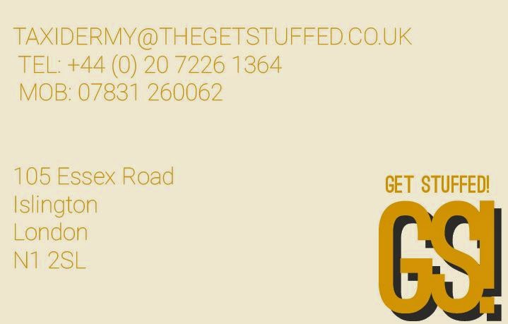
BACK OF BUSINESS CARD:

For the back I was thinking of including their contact details and possibly a tagline produced from the information from their website. I began the layout by gathering the information that I need and placing it in illustrator -

  • T: +44 (0) 20 7226 1364
    M: 07831 260062
    F: +44 (0) 20 7359 8253
  • A: 105 Essex Road
    Islington
    London
    N1 2SL


I started by adding the text in the same typeface as the logo and aligning it to the left. I also added the logo again in the bottom right and the company name so people know what it's actually called. 
I messed around with typefaces and background colour to see which works best:


I changed the typeface to Roboto Light Italic, as it isn't as condensed and easier to read. It also gives a bit of a break from the logo typeface. I didn't really think the dark grey worked as a background colour, as it hasn't really been used anywhere else. I tried a few lighter shades:


I think these look better, but they are still quite dark. I changed the typeface from italic too, as I think it looks more uniform and professional:


Finally, I changed the background to a more off-white colour, and finished my first business card: 


I continued this theme onto the other two: 


OUGD405 - Studio Brief 4 Taxidermy business research

To start off this project, I decided to look into existing taxidermy businesses to get an idea of what is already out there, and what I could do to improve. The first website I came across was Expert Animal Artistry by Chris Elliot - http://taxidermist.uk.com/home/1731594

Here is a screenshot of the website: 


Straight away when looking at this, the website already looks old and deflated. The layout isn't inspiring and makes you feel like his work wouldn't be the best on the market because of the way it has been reflected on his website. The colours are drab and boring, and there is no proper style within the text of this page. There are different typefaces and sizes, and it doesn't look like there has been much use of a grid system. Also, the logo to this business (top left corner) is quite small and not very easy to read. It's not memorable and won't spring to mind when you think of a taxidermist.

The next website I came across was Taxidermy by Mike Gadd -
http://www.taxidermy.co.uk/

This website is a lot better than the first one I looked at, the layout is easier to use and is more coherent with the rest of the design of the website. Saying that, the website is still quite boring, and has hardly any use of colour (apart from the images themselves). This keeps the focus on the taxidermy but makes the rest of the business look bland. The logo is okay but I think it could be better, playing around with the initials of the taxidermist and possibly using some negative space. 

Here is a website I found called Get Stuffed - 
http://www.thegetstuffed.co.uk/


Firstly, the use of a blackletter typeface in the logo makes the firm look old and dated already. This typeface doesn't match with anything else on the website and looks out of place. The rest of the website is a mixture of serif and subtle sans serif body. The layout is okay and easy to work but again, doesn't look inspiring. 


I came across a site called UK Taxidermy for Sale - 
http://www.uktaxidermy.co.uk/


Again, the website is uninspiring. The layout is functional but doesn't grab your attention. The logo is just the name of the site in a serif typeface that looks old fashioned in its self. 

The final website that I'm going to analyse is the weird & wonderful - 
http://www.theweirdandwonderful.com/


The logo is there straight away, and it's something that will stick in your mind. Although theres not a lot of use of colour here, you can tell some thought has gone into the design and layout of this brand. The website makes the products look more desirable, and even though it is quite similar to ones I have looked at, it makes you want to buy the product more because of the extra work they have put into the platform to showcase their products. Overall I think this is the best example I have found so far, even though it doesn't really come close to what I want to do.

I'm going to re-brand Get Stuffed, as I really like the play on words and I think it has a lot of potential as a brand.