Thursday 19 May 2016

OUGD505 | MODULE EVALUATION

Design practice has produced some varied results. I wasn't extremely happy with my outcome for Licence To Print Money, but Product, Range, Distribution was one of my favourite outcomes for Level 5. A lot of this has to do with time management and realistic goals. 

Licence To Print Money already started off as a challenging brief, giving a lot of restrictions with size, colour and printing method. I was already working in a way I was unfamiliar and uncomfortable with, and trying to push that even further was evidently too much. The work I produced was not what I imagined it to look like, and also not very well produced. The idea worked conceptually but as I am inexperienced with the processes, it didn't work as well as it could have in practice. 

Product, Range, Distribution was a welcome change to processes that I wouldn't particularly choose myself. Firstly, the research stage helped me create all of the content I needed for the brief. Having a "blurred" focus before settling on a concept was very useful, as I researched into a lot of different areas and gained a lot of knowledge. I was able to work comfortably within photoshop and illustrator and freely create for an idea that I was passionate about. Working with illustrators who were also interested in the subject was motivating and ensured that I stayed on track with time management. They needed to be briefed on the subject and it was up to me to have everything ready to give them the information they needed. I found this really stimulating and had a drive to create the work and flesh out the concept. As this brief was the final brief of the year, I was able to give it my full attention and wasn’t distracted by any other modules or projects. 


Overall I feel that Design Practice has been a mixed module for me. The contrasting results come from being enthusiastic about the brief and being comfortable with the processes used. Pushing the brief too far when there are already restrictions in place is something I have learned to be cautious about, and that its fine to stay within your comfort zone sometimes. 

OUGD505 | STUDIO BREIF 2 | EVALUATION

Product, Range, Distribution is one of the briefs I'm most proud of in level 5. As it was the final brief, there was a lot of time and effort placed solely on this project. This allowed me to really focus on the deliverables and produce a well rounded submission.

Having freedom with the context of the brief was very refreshing, and choosing something social/political/ethical was extremely relevant to my interests outside of graphic design. Combining the two was really enjoyable for this brief.

The overall resolutions to this brief were produced to a high standard. Working with illustrators was something I'd done before this year (responsive collaborative brief), though setting them the brief myself was a much better experience. Being able to tailor their style to my project was also extremely rewarding when the final pieces were put together.

Creating something for a cause that I'm passionate about, and relating it to graphic design and the area that I enjoy made me more enthusiastic about the whole brief. I set myself high standards and was able to complete them. Using methods I was comfortable with (e.g. digital processes) allowed me to create quality work at a fast pace.

Overall this is one of my most successful briefs and I'm pleased with the outcome. The only issue I have with the deliverables is the activity folder. Proper planning could have made it a lot neater, rather than sticking the pockets on at the end.

Sunday 15 May 2016

OUGD505 | STUDIO BRIEF 2 | E-FLYER

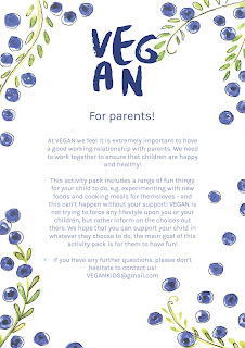
To increase the distribution of the activity pack, an e-flyer was designed to ensure parents that the booklet is extremely safe for children and not in any way trying to force a particular lifestyle upon them. As parents will be most likely purchasing this activity pack for their children, it's important that they are aware of the content of the pack and know that the purpose of it is to be informative.


The flyer also includes details of how to contact the brand if parents have an issues. The e-flyer will be accessible online and to parents who sign up for the newsletters. 

Saturday 14 May 2016

OUGD505 | STUDIO BRIEF 1 | EVALUATION

I started this brief with optimism and an idea I felt I could do well - as I'm extremely interested in the effects of climate change and sustainability. I wanted to push myself conceptually and create an interesting resolution that people could interact with.

As the designs developed, I felt that I was quite out of my depth with time management and the scale of the project. The aesthetic of the bank notes is also not what I had imagined. Reflecting upon my design decisions I feel that using real images would have been more effective, using a halftone effect for it to screen print.

Reflecting on my concept, it was appropriate to only design 1 bank note as the deliverables were being exhibited. My concept required designs for 7 bank notes as they worked as a set, and I decided to screen print 3 of my designs. This also pushed me back in terms of time as I could have spent more time developing and improving the designs rather than a lot of time printing them.

Having to make essentially 2 designs for each bank note (screen print and UV) pushed me further on the time aspect, and I felt that I could have improved on the finishes and quality of he designs if I gave myself more time. As I wasn't familiar or experienced with screen printing, I felt that this also hindered my design process. The lack of colours/details allowed on each scene had a great impact on the overall design. Not having access to UV ink in university also had an impact on my design, as I had to find my own source. As the paint failed, using a UV felt-tip was the only option for my design and it didn't show up as strongly as I had hoped.

I feel like I may have tried to push myself too hard for this brief. The final resolutions are satisfactory for the requirements of the brief, but I personally feel that it's not up to standard. A number of factors played into this, but mainly it's due to inexperience with the processes and trying to push the brief when I could have created something of higher standard that was conceptually simpler.

OUGD505 | STUDIO BREIF 2 | EXPANSION

As the popularity of veganism grows, there needs to be more content for children and parents. Expanding the project will see expansion packs of the current activity pack - e.g. new recipe cards and more food cut outs, but also brand new packs all together.

A website would also be useful for an expanding brand, where there cold be forums, blogs, tutorials, recipes and brand new vegan activities and ideas.

Parents could also sign up for a newsletter that gives them some ideas for fun activities to plan with their children. Eventually, there will be a wide range of activity packs for children to choose from and make fun out of veganism - something many adults seem to find restrictive and boring.


Friday 13 May 2016

OUGD505 | STUDIO BRIEF 2 | PRINTING

Recipe cards - 
The recipe cards were printed on 300gsm stock and laminated so that they are durable and can be wiped clean.


Create a meal - 
The sheet and cut outs were printed on the same stock as the recipe cards and laminated on the printed side.


Stickers -
The stickers were printed on sticker paper and cut out with the vinyl cutter


Activity book -
The activity book was printed on 200gsm stock that was suitable for drawing on. The cover was the same stock at 300gsm to make it durable and allow it to protect the contents.