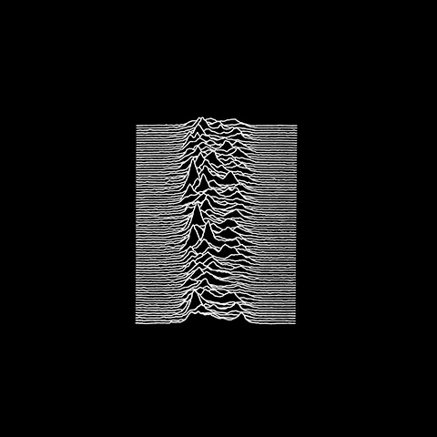
This cover shows the radio waves from a pulsar in space. Although the design is quite simple over all, it makes use of the negative space and draws you into the introcate patters created by the pulsar.
Another famous album cover, Nirvana's Nevermind was created and designed by Kurt Cobain himself:

This album cover was created on a tight budget, using a friend of the photographers son in the shot. The design is also quite simple, using real life photography and placing a logo on the side, but the use of a naked child in the image became really iconic and stuck in peoples minds.
Pink Floyd's Dark Side of the Moon album cover is also one that springs to mind, designed by George Hardie:

This simple design shows a beam of white light being separated into its components via a prism. The negative space has been used well giving the design to breathe, and it doesn't over complicate things, especially as there is a lot of colour in a small section of the design.
I also decided to look at some artist's that i'm interested in, to give me some more direction in terms of style and aesthetic.
Throughout my A2 graphic design course, I looked a lot into Tara McPheresons work. I believe she still influences me today, and I decided to take a look at some more of her work for this project. She uses a lot of traditional techniques to create her work, including painting and printing. A lot of her designs are abstract and surreal, which I thought would work well for my designs as the cover is supposed to conceal the identity of the artist/song.


I feel like this sort of style could be suitable for my design, with context and reference to the song.
I have also looked at Sarah Illenberger for ideas of a more photographic medium. Her work is colourful and ambiguous.


Annie Atkins specializes in graphic design within film, and her work within the Grand Budapest hotel really inspires me, as she was the one who designed everything. There's bright colours and grand typefaces, and everything looks in place.


No comments:
Post a Comment