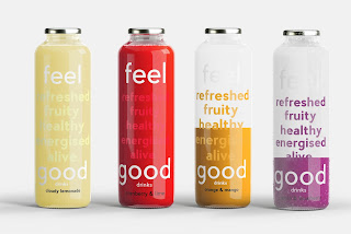
I created this quick mock-up to show my concept more clearly, showing that as you drink, you feel refreshed, fruity, healthy, energised, alive, good. This reinforces the brand as well, as ultimately you are feeling good at the end of the drink.
Implementing this idea with the logo was quite difficult, as the logo would have to be split in half to get the "feel" at the top and "good" at the bottom.
I tried this out, but the logo didn't work as well and the idea seemed lost. I developed this idea further, having the logo in the middle, and the words in the background on low opacity instead:
This version felt more refined, and the logo is the stand out component of the design. The words appear all together as a background pattern as you drink it, showing the user everything the juice has to drink all at once.


No comments:
Post a Comment