Wednesday 27 January 2016

OUGD505 | STUDIO BREIF 1 | PRIMARY RESEARCH

Peoples history museum held an exhibition titled "Show Me The Money". It held examples of currency from around the world and exhibited art work dedicated to currency and its effect on society.

Looking at examples of real money has been beneficial to starting off this project, as going into it has felt a bit hazy.


The majority of the designs here are very intricate and detailed. It seems it would be hard to replicate styles like this using only traditional techniques. I feel I would want to create something more modern and contemporary, and possibly moving away from historical figures. 

Tuesday 26 January 2016

OUGD503 | SECRET 7 | THE BREIF

The brief: 

Secret 7” takes 7 tracks from 7 of the best-known musicians around and presses each one 100 times to 7” vinyl. We then invite creatives from around the world to interpret the tracks in their own style for every 7”. 700 sleeves are exhibited and then sold for £50 apiece. You don’t know who created the sleeve, or even which song it’s for, until you have parted with your cash - the secret lies within.

The songs for this year are: 

  • Chvrches - Clearest Blue
  • Etta James - At Last
  • Jack Garret - Worry 
  • The Jam - Art School
  • John Lennon - Imagine
  • Max Ritcher - Dream 3 
  • Tame Impala - The Less I Know The Better

Analysis: 

Taking part in last years competition makes me more aware of what Secret 7 are looking for in a winner. As the artwork isn't meant to depict any part of the song (because its a secret), the artwork can be really abstract and ambiguous. The quality of the artwork has to be great, but it doesn't have to have any meaning towards the song - as that could possibly give it away. 

The song I am most drawn to this year is Tama Impala's The Less I Know The Better. Their songs are quite psychedelic sounding with lots of distortion. Their artwork is very "out-there", so for Secret 7 it may be better to be quite reserved. 

Secret 7 is a really exciting brief, as you can create anything that looks good. There are no ties with this brief, so the artwork can be anything you want it to be. 

Thursday 21 January 2016

OUGD505 | STUDIO BRIEF 1 | BRIEF ANALYSIS

License to print money

As digital currency develops, "real" money is starting to lose its place. This brief is asking for us to undertake research into physical coins, bank notes and legal tender to come up with a new, engaging design for bank notes of any currency.

The notes are being printed using only traditional printing methods (no digital printing), and being presented on 21cm x 26cm stock to be displayed in an exhibition for Level 4 and Level 5. 

Research into history other cultures could be key to this brief, depending on the concept and message that is being displayed on the money. The size of the bank notes also needs to be considered as they need to be a useable size, but easily distinguished between different values.

I am looking forward to getting the chance to exhibit my work along side fellow students, and exploring different analogue print techniques. 

Wednesday 20 January 2016

OUGD503 | YCN | MOCKUPS

Once I had my final designs, I decided to mock them up properly to see what they would look like in use. This is mainly for the website and the app, as the bottles and print campaign have already been shown.


Tuesday 19 January 2016

OUGD503 | YCN | IMPROVEMENTS

After receiving student and tutor feedback, I looked at my existing designs and decided to make some changes. The design of the bottle remained fairly consistent, but I tweaked aspects of it, so that some exciting, engaging adjectives appear when the juice is all gone. 


The design is largely unchanged, but the empty bottle now has more of an impact on the over all design, allowing the customers to feel good about what they have consumed. The design is ensuring them that it is the healthy choice. I also adapted the design to a smaller bottle, as Feel Good has 3 different size ranges.

I moved onto applying the drinks design to a multitude of print campaign deliverables. I started with a women's magazine as this is a prime area to engage with young women.

I then moved onto other locations, such as busses and bus stops:


The print campaign isn't the main part of the submission, so I didn't spent too much time focussing on it. I moved on to building the app, which I decided to have as a pedometer to promote a healthy lifestyle. As the brief states they want the campaign to be "good, honest fun", I included the option to add other people on the app and compete against them, to create a sense of rivalry between friends. The incentive to use the app, a points system is implemented to reward people for being healthy. There is a game in the app that people can play to earn extra points (but not as much as walking). 


Following the app, I improved the website to suit the app and brand more. I kept the main features and just tweaked the layout and home page. I also included a loading screen to link back to the existing website to create suspense and excitement. 

Loading Screen


Home Page


App


Get Involved


Monday 18 January 2016

OUGD503 | PENGUIN | SUBMISSION

I submitted my designs to Penguin on the 18th January in pdf format. These are the images I sent to them:


Wednesday 6 January 2016

OUGD504 | MODULE EVALUATION

This module had many different types of brief, ranging from quick 1 week logo designs, to spending 4 weeks developing a promotional website for a music artist of our choice. Having a wide range of briefs helped me get back into university projects after the summer, and the quick 1 week briefs definitely got me back into it. 

The first brief was to create a leaflet that informed the user of the about The Design Process. This was definitely a good brief to have at the beginning of the year, as it acted as a huge refresher for the process in general. I enjoyed having a short brief at the start of the year, as I was eager to discover the future briefs within the module. The brief itself was quite fun, and experimenting with folds and leaflet design was something new to me. 

The second brief was to pick any project from Kickstarter and create a logo for them. I particularly enjoyed this brief, as it had a “live” element to it, as we were encouraged to speak to the owners of the project and get any feedback we could off them. The project that I chose was the Bagelry based in Liverpool. Their Kickstarter was raising funds for their new cafe. I contacted the owners and they really liked my designs, but unfortunately they’d already purchased everything for the cafe with their existing branding on it. Even though my designs weren’t used, it was a really cool brief and being encouraged to speak to clients and get feedback outside of the classroom was really refreshing! 

Our third brief for the module was an extension of the summer brief. We were to create a publication based around a place we had taken pictures of over the summer. As I was going to Amsterdam in the summer break, I decided to base my publication here. I felt a pressure to get really good images in a short amount of time over the summer, but fortunately I had enough good quality images to fill the publication. Laying out many images over a double page spread wasn’t something I had done before, so I decided to do some primary research for this brief. It was useful to see successful designs and how they were laid out. There were many considerations in this brief, and it showed us that we need to be able to balance lots of different ideas. 

The final brief was set by Only Studio. We were given a brief that they received while working in industry recently, and it was really exciting to see what a “real” brief was like. We had to create a campaign website that was immersive for the user, and boosts record sales for the latest album by an artist of our choice. This brief was very different from all of the briefs we’ve done before. I did struggle quite a lot with getting the design right, as I’ve never created a website or had any experience with UX design. Overall, I enjoyed this brief even though I found it quite challenging. Having the crit with Only was really useful as they had such an in-depth knowledge, and gave me some really valuable feedback.


The diversity of this module has been really enjoyable. It’s been challenging and exciting all of the way through. I did enjoy this module, though looking back I feel as though I could improve some of the work I created. Even though it was a 1 week brief, I think my logo could be more refined and friendly looking. I also feel like the finishes on my publication could be to a better standard as I had to bind it again. This brief has been the start of a huge learning curve for level 5, and I have really enjoyed it. 

Tuesday 5 January 2016

OUGD503 | YCN | FEEDBACK

Showing my work to other students gave me some good feedback regarding concepts for the website and design of the bottles. I also mentioned that I was considering creating an app to go along with the website, but I wasn't really sure what I could include in it. My main inspiration for this was the Dumb Ways to Die app, which was originally a video created by Metro Trains in Melbourne.

The response to the design of the bottles was positive, and many people said that a glass bottle rather than a plastic bottle looks much better and more of a premium product.

Regarding the website, some tweaks could be made to fill in the white space in the background (as it looks too harsh) and make some of the type smaller. They suggested using the teardrop shape in the background/around the edges to create more of a decorative feel, and make it less clinical.

I also mentioned the idea of my previous idea, which uses descriptive words that appear after the drink has been consumed. Everyone really liked this idea, and have suggested that I should try and include this in my designs on the bottles, and also on the website.

When I mentioned the app, people weren't really convinced that it would be a substantial idea until someone suggested that the app could be focussed towards encouraging a healthy lifestyle. The app could include a calorie counter/meal planner that helps people meet their fitness goals and encourages drinking Feel Good as part of their healthy diet.

Overall, I'm pleased with the feedback I've received. I knew that my ideas weren't completely finished, and now I have some areas of improvement that I can work on.

Sunday 3 January 2016

OUGD503 | YCN | CONCEPT DEVELOPMENT

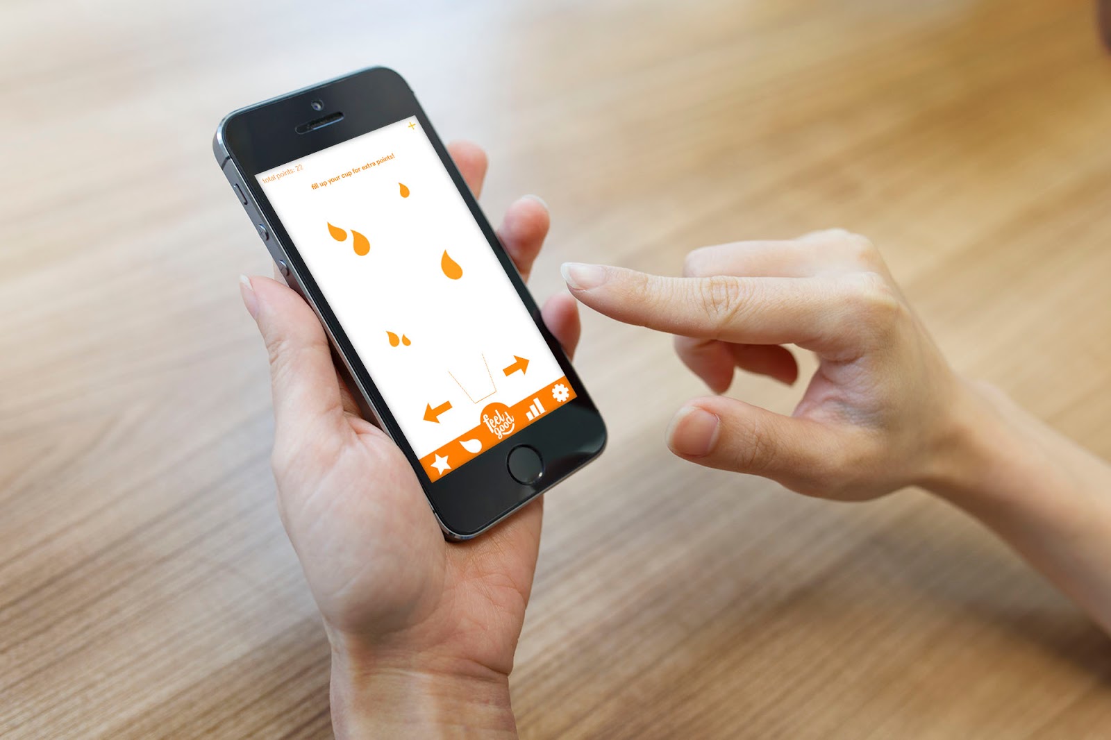
The final concept revolves around re-branding Feel Good, and having the tear drop shape as a "secondary logo" that is included throughout the brand, continuing onto the website and other promotional material. The final design for the juice drinks is shown below:


Mockups for social media websites were also created that have been shown previously:


The social media mockups didn't need to be altered as they already contained the final logo and branding. Next on the agenda was the website.

The aim was to create a website that was cleaner and more user friendly than the current Feel Good website. The main homepage currently consists of confusing navigation, animations and sounds.


The current website looks like its aimed towards younger people around the ages of 6-12. The website that I have created takes a different approach, having the navigation at the top of the page. This part of the design concept still needs work, and I am aiming to get some feedback before I develop it further.

The main home page has rotating images as the main feature, where the user can click and navigate their way through the website (as well as using the navigation bar at the top).


The "get involved!" page is where the user can actively participate in business decisions. Social media will heavily influence these decisions too. Letting the customers decide on new flavours or limited edition drinks will make them feel more included with the company. It also ties in with one of the requirements of the brief, which is "good honest fun." The page looks like this:


The page makes use of the tear drops again, and asks the user to vote on what flavour they'd like to see next. You are invited to cast your vote, and once you've voted you'll see the results displayed like this: 


The background colour has changed to a pale green to suit the winning flavour (at that time), and the tear drops change size according to their popularity. You are also asked to sign up for an email notification when the poll closes to see the results. Keeping the user informed and interacting with the website is the main goal. 

I also began mocking up other parts of the website, including the text-heavy About page. I feel that having different colours for different parts of the website will push users to explore all of the website and also show impartiality towards every flavour. 


The website isn't finished yet. I would like to get feedback on my designs and also develop the features further. For the final deliverables I would also like to create a print campaign. 

Saturday 2 January 2016

OUGD503 | YCN | DEVELOPMENT

After creating a version of the mockup I was pretty happy with, I went on to create all of the current Feel Good flavours:


I felt that it was important to have the colour of the logo contrasting to the juice, to stand out and possibly distract from the background words while the juice was full. I was quite happy with this idea, but not completely satisfied with it. I decided to move onto creating social media pages, e.g. a facebook and twitter page (which Feel Good already have), with the new branding I've created for them.


I created this header for social media pages, using the tear drop shape from the bottles.


I really liked this approach, so I decided to go back to the bottles and apply this design to them.


This design is much more effective. The colours used relate to the flavour, rather than using contrasting colours, and the concept of having words appear as the juice is consumed still works, as they appear through the water drops. The design looks fun and inviting, and can be implemented across many different platforms. 

OUGD503 | YCN | INITIAL IDEAS

Once I had a logo, I needed to move onto re-designing the bottles. The concept that I had in mind for this was having a clear glass bottle, with words that appear as you drink the juice, e.g. "refreshed". The idea being that the drink makes the person drinking it feel "refreshed", and the packaging reinforces this idea.


I created this quick mock-up to show my concept more clearly, showing that as you drink, you feel refreshed, fruity, healthy, energised, alive, good. This reinforces the brand as well, as ultimately you are feeling good at the end of the drink. 

Implementing this idea with the logo was quite difficult, as the logo would have to be split in half to get the "feel" at the top and "good" at the bottom. 


I tried this out, but the logo didn't work as well and the idea seemed lost. I developed this idea further, having the logo in the middle, and the words in the background on low opacity instead:


This version felt more refined, and the logo is the stand out component of the design. The words appear all together as a background pattern as you drink it, showing the user everything the juice has to drink all at once.