POSTER DESIGN
For studio brief 4, we need to do some preliminary research on poster design, looking into the different genres and designers. I already have a few people in mind that I want to look at, including Kate Moross and Neville Brody, but hopefully after conducing further research I will have a wider knowledge of the different types of posters and designers.
PROPAGANDA:
Propaganda is a type of poster design that is used to influence an audience. It played a big part in many wars, and usually these posters can be made sense of without having to read them. Many countries have their own style of propaganda, for example, these are posters from Britain in WW2:


These posters are mostly encouraging, making the people of Britain want to keep fighting in the war. Some of them are made to make you feel guilty, for example, "who's absent? Is it you?", pointing to the viewer. It makes you feel like you should be fighting in the war, or at least doing your part. Everyone should all join together to help win.
Here are some posters from nazi Germany in WW2:


These posters are glorifying Germany, rather than showing encouraging people to work together, it shows that Germany are supreme and gives them a feeling of assured victory.
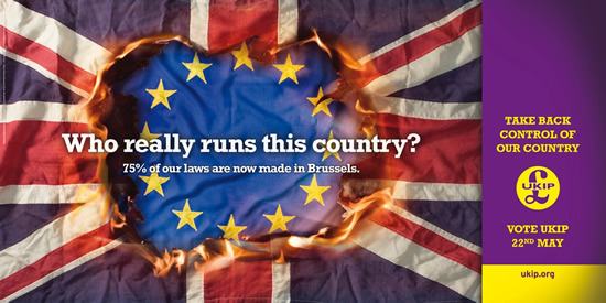
Modern propaganda also exists within politics today. Here are some examples:


TV AND FILM:
It is very important for TV and film to get across their story or grab peoples attention with poster design and advertising. Here are some posters from the popular TV series Game of Thrones:


These posters are all very similar in the way they look, but all present different characters and different stories. They look very dramatic and make people who haven't watched the series want to know what's going on.
Here is a poster from the Star wars trilogy, which I really like. It evokes the spirt of the film and has really nice colours:

Tv show, UTOPIA has a very striking poster design:


They use bright colours that correlate with the cinematics within the series, and have used Futura to display their logo, which is crisp and clinical, which also fits with the tone of the show.
MUSIC EVENTS:


SHEPARD FAIREY:
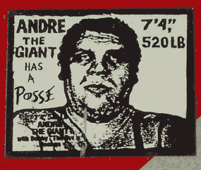
For many years, music events such as small gigs or huge concerts have used posters to advertise their events. I have found a collection of inspiring posters here that are advertising musical events:

SHEPARD FAIREY:
Shepard Fairey is probably best known for his poster for the Obama HOPE campaign. He has also designed many other posters:


He grew up in America in the 80's and his art emerged from the skateboarding scene in which he spent his adolescence. He is now known as one of the most influential street artists. The main technique he uses is printing.
KATE MOROSS:
Kate Moross is a London based designer who likes to work with 3 sided shapes, illegible typography and free form lettering. Here are some examples of her work:


From these images you can definitely tell she has her own style and way of working. She uses a lot of colour and usually hand draws her lettering. Some of her clients include Ray-Ban, Converse, Vogue, Nike, Adidas, Nokia, Samsung, The Guardian, Ralph Lauren, Virgin, Vice Magazine, Cadbury and Topshop. I really like her style and how she turns her simple doodled letterforms into something really colourful and creative. The majority of her posters feature type, but a lot of the time they look like images.


NEVILLE BRODY:
Neville Brody is a large name in graphic design, and is known for this work for The Face magazine, Arena magazine and being a founding member of Fontworks. Here are some examples of his work:
A lot of his posters focus on type, and have a large emphasis of communicating a message.
No comments:
Post a Comment