Grid, Layout and Composition:
Grids are used in graphic design to layout a page and to give order and structure. They were instituted by modernists (though they have been used for thousands of years before this time) and were one of the guidelines that you should follow to create modernist work. There is a lot of research I need to conduct about grids to understand them fully, and this will help me to create my own bespoke grid for my typeface.
Grid terminology
Margin - Negative space between the format edge and the content.
Flowlines - alignments that break the space into horizontal bands.
Modules - individual units of space separated by regular intervals.
Spatial zone - groups of modules banded together to form distinct fields.
Markers - Placement indicators for subordinate or consistently appearing text.
Columns - Vertical alignments of type that create horizontal divisions between the margins.
I have also created this simple grid to show this terminology:

Manuscript grid
A simple grid where the base structure is a large square taking up most of the page. It's job is to accommodate extensive, continuous text, like a book or long essay.

Column grid
A very flexible grid with multiple columns that can be used to separate different kinds of information.

Modular grid
These are used for complicated projects. It is essentially a column grid with many horizontal lines creating modules. Each module defines a small chunk of information.

Hierarchical grid
An odd grid that doesn't fit into any category, based on an individual project rather than regular repeated intervals.

Grids surround us everywhere in our everyday life. Every newspaper, magazine, book, website, logo, application, game etc all involve grids for their design.
Grid history
Grids have been used for many years to order and structure work. "Neither "graphic design" nor "grids" were talked about until the mid-twentieth century. Once named, complex grid structures comprising multiple columns, fields, baseline grids, and so on poured forth as never before, but it’s not true to say that designers or their predecessors—commercial artists, printers, and scribes—hadn't been thinking about content, proportion, space, and form before this."
Before typesetting and printing was available, books and type was available to read. Religious texts were laid out by scribes and looked quite modern, aligned to the left with multiple columns:

Canons:
The Van de Graaf canon is a way of dividing up a page into pleasing proportions. You can see that it has been used in the image above. Its also known as the "secret canon", and has been used in many medieval manuscripts. The Van de Graaf canon works with any page size and height ratio, enabling the designer to position the text on the page so it looks in proportion. Here is an image of the Van de Graaf canon:

Graphic and typographical designers still use this method today, here are some examples:


Jan Tschichold has created a canon that is known as the golden canon. It's based on simple simple integer ratios. The circle on the left determines the type area height, and the diagonal lines demonstrate the width. It results in margin proportions of 2:3:4:6.

The Golden canon bears a strong resembelence to the Van de Graaf canon, and is seen throughout many designs.
Tschichold also created another canon named the Octavo. It is also formatted within the golden ratio to give pleasing proportions. The text area and margin proportions are determined by the starting page proportions:

The Golden Ratio:
The golden ratio is a grid system found in nature, and it is the relationship of numbers in the Fibonacci sequence:

A lot of pieces of artwork, architecture and even the human face are all meant to be based off the golden ratio, but it could also just be a coincidence. When these points on the image above are plotted into a grid, it looks like this:

The golden ratio can be found throughout history within art and design dating back to as late as 4,000+ years ago. It can be seen in architecture, and a good example of this is the Parthenon:

Using the golden ratio gives a building that feels entirely in proportion.
The golden ratio can also be found in famous pieces of artwork -


But this may all be coincidence, as there is no actual evidence that these images were actually based on the golden ratio.
The Rule of Thirds:
The Rule of thirds is a grid that is mainly used in photography, but can also be applied to web design and page layout. This rule means that the focal point of the image should be overlapping a third of the page, for example:

Here is an example of the rule of thirds used in web design:
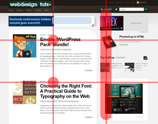
You can see that the main information on the left of the page is half way through the first and second third of the page. This design looks more balanced and pleasing to view.
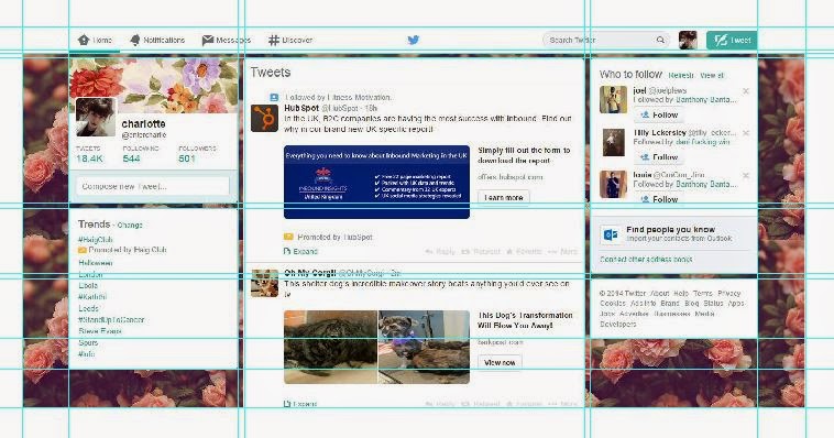
Social media:
Here I have taken screenshots of my facebook and twitter pages and applied a simple grid to them to see how they compare -


iPhone:
Phone interfaces also have many different grids, including the layout of the apps, the app icons and the design of the actual phone. Here is an image of the grid for the apps on iOS7:


This grid is different to ones that I have looked at before as it incorporates circles and diagonal lines. It gives a clear structure to app designers and I think the circles and diagonal lines will be very useful to designers as there are a lot of varied app designs. It also talks about the golden ratio, as I have previously mentioned.
Another part of the iPhone that has a grid is the home menu:

This grid is quite simple but it lays out the basic structure for all the apps that fit on one screen, so it is organised and looks slick:

The physical structure of the iPhone also has a grid that can be applied to it. Here I have a picture of an iPhone 6 and have applied a simple grid to it on illustrator:

The back and the front both follow a similar grid design, which you can see on this image. The speakers on the top of the phone align with the dark grey strip on the back of the phone. It is clear that Apple have used a grid system to design the front and back of the phone at simultaneously.
Newspapers:
Here is an image of the front page of the guardian. I have applied a simple grid to it on illustrator:

The grid system here looks quite modular and there are 5 clear columns for text. This is so that theres enough space for text and the text can be separated into the correct areas. There is a dedicated space roughly in the middle of the page for an image.
I have also looked at the front of The Independent, which has a similar target audience as The Guardian:

This grid looks more like a column grid compared to The Guardian. It has a larger image and the headline takes up more space. There is less text on the front but is still made up by 5 columns.
Both of these grids share similarities and differences, and as they have a similar target audience it is interesting to compare and contrast them. The Guardian is more text heavy, and features less images and large headlining text, where as The Independent has a grid that compensates for the loss of text and has more imagery and large text.
Modernism:
The modernist movement introduced grids as a rule of graphic design, a way to structure and organise work.
Josef Muller-Brockman is a graphic designer that works strictly within the grid. He states that it is an organisation tool that makes it easier to read the message within his work. Here is an example of his work with a grid that I have placed over it:

It is clear just by glancing at the grid that he has made sure everything aligns and his entire work is centered around this grid. Although some text is off center or looks slightly out of line somewhere, you can see that it is aligned with the grid in some aspect. I think this design is really clever and interesting to look at. It communicates a message in a simple and effective way.
The Postmodernist style occurred after modernism. It is a response to the rigid layout and breaks all the rules and guidelines the modernists tried to lay out. There are no grids in postmodernism, there is no clear order or structure. The form comes before the function, the aesthetic here is key. A good example of postmodernist work is this piece designed for a David Carson talk by Garren Wright:
Postmodernism:

As you can see just by looking at the poster, there is no use of a grid at all. Some of the letters are backwards, and the words don't flow like they should. There is no order here, and especially since the type is over a busy background it makes it quite hard to read. There is no point attempting to place a grid over this poster as it wouldn't make sense or be any use to any other poster design. It is truly unique.
http://www.graphics.com/article-old/brief-history-grids
http://www.vanseodesign.com/web-design/grid-types/
https://www.facebook.com/
https://twitter.com/
http://thedesignblitz.com/best-ios7-icon-templates-ui-kits/
http://www.pinterest.com/pin/550283648190490555/
http://www.creativebloq.com/design/designers-guide-golden-ratio-12121546
https://www.behance.net/gallery/1424449/David-Carson-Event-Poster
http://retinart.net/graphic-design/secret-law-of-page-harmony/
No comments:
Post a Comment