Friday 19 February 2016

OUGD505 | STUDIO BRIEF 1 | INITIAL IDEAS

Researching into other re-designed banknotes has helped me with determine which way to go with my project. Running with the theme of sustainability, my initial idea was to feature iconic natural landscapes and use UV ink over the top to show the pollution and damage that is occurring with climate change.


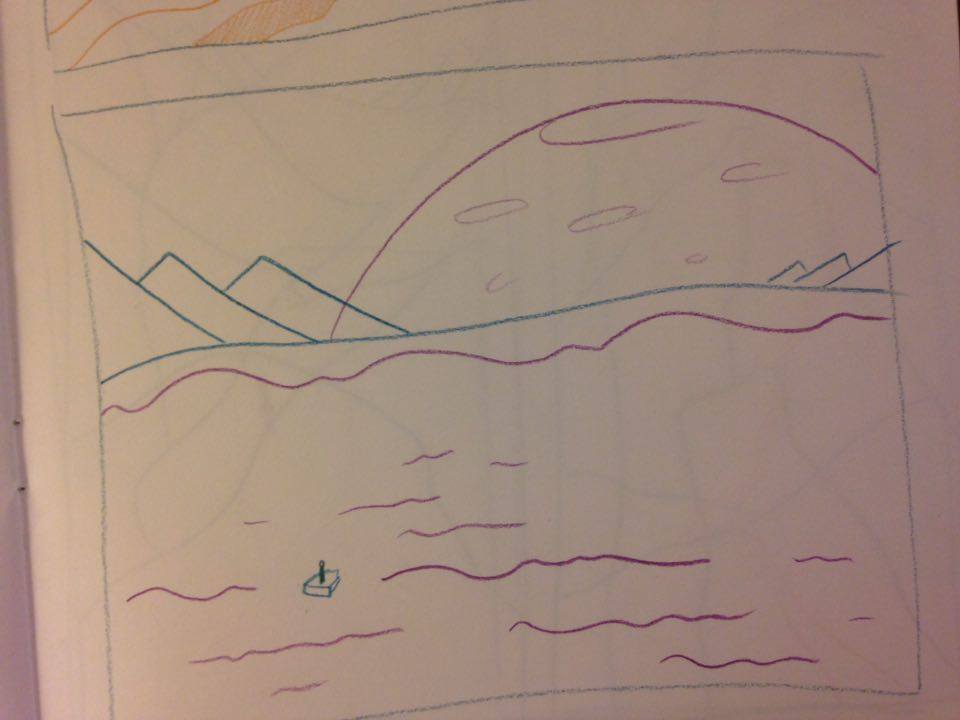
Talking to tutors and peers and discussing my idea, it seemed like a good idea to make a global currency, as climate change is a global problem. A bank note design could be produced for each of the continents, and new global currency will have to be created with at least 7 denominations.

Creating a new currency name that wasn't attached to any part of the world was quite difficult. I knew I wanted a simple, catchy one-word name. Not spending too long on this part of the project, I decided to go with Credits. Its simple and timeless.

The seven continents all have their own issues including climate change. Doing some quick research into what could happen in each continent I complied this list:

Africa - reduced biodiversity, drought
Antartica - ice melting
Asia - air pollution
Europe - extreme weather
North America - heat waves/wildfire/drought
Oceana - hole in the ozone layer
Sough America - oil spills/deforestation

Further research needs to be done into climate change and what causes it in each different region.

Tuesday 16 February 2016

OUGD505 | STUDIO BRIEF 1 | FURTHER RESEARCH

To begin this brief, I undertook research into examples of re-designed banknotes to gain inspiration for my own project. My initial thoughts on this brief were to create something that points towards sustainability and the future of the planet, showcasing important natural landscapes on the bank notes as a reminder to everyone that we need to do our part to protect the planet.

Some examples of bank notes using achievements of science and technology are included here:


The designs are very detailed and it would be difficult to produce something like this at a high standard using analogue techniques.


These notes are more simplistic and have a larger focus on colour and are more suited to my style of working. These designs would be easier to print using traditional methods, but would still be highly complex and would need multiple different processes.


These examples of single colour notes look very simple but effective. The pink note is modern and contemporary, where as the purple looks more traditional and detailed. The style of the purple note is what I had in mind for my original idea. 


The Norwegian passport is an official document which makes use of print finishes. It uses glow in the dark ink to change the scene at night time. I really like this idea, and would love to produce a bank note with a hidden message thats displayed under a certain light. 


OUGD503 | SECRET 7 | SUBMISSION

I submitted two sleeves to Secret 7 this year. They each varied in style, but had a rough concept that was very similar. The main ideas I wanted to portray through the designs were the struggles the main character in the song faced with his crush. They didn't have any love in the relationship they had, and the male character in the song is confused and upset.


The barren landscape is symbolic of the relationship the two people have in this song. There is no love between them, only frustration and loathing. 


The distortion represents the frustration of the male protagonist of the song, as he is unhappy at his crush not being able to commit to one relationship. 


Monday 15 February 2016

OUGD503 | COLLABORATIVE PRACTICE | INITIAL IDEAS

Our first meeting as a group was to come up with an initial concept for the brief. We discussed attributes of Adobe, and what we wanted the young creatives to feel when they saw our campaign. The main focus of our campaign is to inspire the audience and have a large focus on artwork. We wanted people to feel confident in their abilities, and confident that they can use the software.


After some discussion and note taking, we decided to have our campaign based around the idea of discovery. The software available on the cloud is extensive, and each program has lots of tools to offer. We want the campaign to show that through the cloud, you can discover something new and exciting, that you previously hadn't noticed before.

We came up with the idea of creating immersive, interesting landscapes that appear through the outer shape of the Creative Cloud logo, to show the viewer the amazing possibilities that come with using the cloud. Our preliminary ideas consist of brightly coloured landscapes and rough mockups of the posters. Fennell created some rough sketches, then put them onto the computer. Me and Emily mocked these landscapes into some poster ideas to discuss at our next meeting.

Fennell's sketchs -


Poster Ideas - 


OUGD503 | COLLABORATIVE PRACTICE | ADOBE BRIEF

The Challenge
Your challenge is to take the existing identity for Adobe Creative Cloud, and remix and reimagine it for a youth audience. Then, devise a launch campaign that’s inspiring enough to appeal to this group.This is an opportunity to come up with a truly creative and holistic brand campaign, across every aspect of the marketing mix, for a product that enables you to do anything. The only limit is your imagination.

Who Is It For?
Adobe Creative Cloud and a young, creative audience. You, effectively. 

What to Consider


Young creatives are the life-blood of the industry and are its future. You are its future. So what would inspire, agitate, and enable you and your ideas?
  •  Play with the existing Creative Cloud logo. You need to keep the current shape, but what can you do with it? The product is diverse, so be diverse in your approach.
  • Naturally you need the nuts-and-bolts of any identity, so think about colour typography, imagery, tone of voice, brand applications and touch-points, etc. But could you also reimagine what brand identity actually is?
  • Apply your remixed logo and identity to a campaign idea (or ideas) that will bring the product to life for its audience.
  • This campaign should consider social and digital, in whatever media or on whatever platform you think is appropriate – think big, experimental, experiential, immersive. But also be relevant to the product, and keep one eye of consideration on the Adobe brand too.
  • Think about the best way to reach your audience, and more to the point connect with them. What’s the best way to explain and explore the product? Where could that happen? 
What's Essential

  • A reimagined brand identity and logo for Adobe Creative Cloud. The logo must keep the Creative Cloud shape, that’s the only rule.
  • One or more campaign idea(s) that launch / celebrate the product.
  • Specify in your entry whether or not you used Adobe desktop and mobile apps to create your submission. 


Analysis:
This brief is quite broad in terms of the deliverables and really gives us a lot of freedom in what we can create. The main part of the project is to create a campaign focussed around the Creative Cloud to entice a younger audience. We will achieve this through an immersive campaign that captures the imagination, and shows young creatives what they can actually achieve. Working in a collaborative group with different skill sets gives us an advantage within this project, as we can apply many different disciplines to the campaign to create something suitable and effective. 

OUGD503 | COLLABORATIVE PRACTICE | PARTNERSHIP AGREEMENT

After the mixer I was contacted by Fennell, a 2nd year animation student who said she was interested in working with me. I already knew I wanted to work with an illustrator, so I was eager to meet up with her. Emily Patrick from graphic design was also interested in working with me, so we all met up together and discussed what we wanted from the brief and which projects we were interested in working on. 

After some discussion about Monotype and Designbridge, we decided that the Adobe brief was the one most matched to our skills. Monotype was restrictive for Fennell as we were only allowed to use type, and Designbridge didn't allow for much creative freedom as the main requirement was to be gender neutral. 

Once we had decided on a brief, we had a discussion of our rough roles in the project and filled in the partnership agreement: 


Fennell is also confident with creating short animations, which we can use in this project to promote Adobe through many different mediums. This works to our advantage and boosts our skill set, as me and Emily aren't as confident in using animation software. 

OUGD503 | COLLABORATIVE PRACTICE | THE BRIEF

Studio brief 2 encourages us to collaborate across courses, responding to either a D&AD or YCN competition brief.

The brief states we will need to: 

1 – Choose a creative partner based on the creative possibilities of your collaborative practice. Complete the collaborative practice form provided in order to identify your individual and joint interests, abilities, roles and responsibilities.

2 – Visit the D&AD/YCN website to find out more about the organisation, opportunities and resources available online.

3 - Select an appropriate D&AD/YCN Awards brief from the downloadable briefs section of the YCN site. Make sure you download any general information and specific brief related resources.

All of the other considerations are based around the brief that we choose. Once we have our collaborative groups, we need to decide on what the brief is and the best way to tackle it.


Wednesday 3 February 2016

OUGD503 | SECRET 7 | DEVELOPMENT

After creating something that was heavily based on photogrpahy and editing, I decided to divert away from that and create something more vector based.

Looking at works by Tom Haugomat made me very inspired, and prompted me to experiment with vibrant, surreal colours and landscapes.


I looked at some landscapes online as a reference, and started to create my own versions by drawing them out and vectorising them. 


This was my first attempt, although it was quite difficult to create all of the details I wanted using only flat blocks of colour. I decided to try a different scene which was taken from a more suitable angle. The next development was based on this image: 


Adding the trees proved too difficult and didn't fit right with the simplicity of the design. The final development features more muted, purple pinks with a very pale sun in the sky. 

The barren landscape represents the loneliness of the male lead's part in the song. The minimal design represents how he doesn't want to know any details of his crush's relationship, The Less I Know The Better. 

Monday 1 February 2016

OUGD503 | SECRET 7 | INITIAL IDEAS

To create something abstract, I decided to take a photograph and distort it into something completely new. I did this using Photoshop effects, such as blurring, distorting and pixel sorting (which needed separate software).


OUGD503 | SECRET 7 | RESEARCH

Looking into Tame Impala's current album artwork, they have quite a surreal and retro feel to them. They are abstract artworks rather than covers that relate to the music. 


The track The Less I Know The Better doesn't have any specific artwork as it isn't a single, but it's from the latest album, Currents (top right). The lyrics describe the painful moment of finding out that the person you love is in a relationship with someone else. Some lyrics to support this are: 

Someone said they left together I ran out the door to get her She was holding hands with Trevor Not the greatest feeling ever Said, pull yourself together You should try your luck with Heather And I heard they slept together Oh, the less I know the better The less I know the better

Some online articles imply that the song has feminist themes, stating:
"Directed by CANADA, “The Less I Know The Better” offers a lot to read into along with its poppy visuals and, just like the lyrics of the original song, centers around a dude who just can’t deal with the fact that his crush is in command of her own pleasure. Sorry, man, but Trevor’s in and you’re out." - https://www.nylon.com/articles/tame-impala-the-less-i-know-the-better-video

From the video for this song, it's clear that the female lead has made her choice to be with Trevor, but the male lead can't really accept that and won't move on stating the less he knows about their relationship, the better.

Secret 7's winners from last year were all very abstract and artistically driven. I feel that creating a high quality artwork, rather than having a concept linked to the song will give me a better chance of winning.