
Some of the feedback was to apply the liquified text to the whole border, and have the information in the center. I tried this, but it looked too busy and not very effective. It was also hard to replicate the same style of liquified text as it was just a one off. For example:
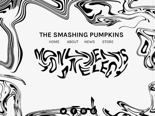
I decided to have the liquified text in the background instead with a low opacity, and invert the entire website so it was predominantly black with white text. This looks more sophisticated and subtle. I added the comments section and the slide show which will feature this weeks clue and a pre-order album button:


This layout makes it look more like an actual website. The ability to scroll down and read the comments makes it feel more traditional and user friendly. I mocked up the week 1 website on an iMac to get a feel of how it would look, and how it would scroll:

I continued with this layout, and created the next 3 weeks complete with clues:


It seemed like a good idea to move away from gifs for the clues, as I want people to share these images on social media and discuss what they could mean. Although a gif could look really interesting, it would be too much movement coupled with a slideshow of information.
After this, I moved onto creating the social media application. The user can hover over the clue and share this on any social media they like. They write the comment on the website and it will be posted automatically, adding the hashtag #MonumentsToAnElegy on the end. This will create hype and have people guessing about the album, and what the clues mean.

Finally, I created the weeks 5 - 8 part of the website. The first image that comes up on the slideshow will be a link to the iTunes website to buy the album. The comments section has been removed and replaced with tour dates. The second image that appears will give you more information on the tour by clicking the link by taking you to a page that lets you purchase tickets.


I mocked up this part of the website to show how it will scroll, similarly to the iMac:

Once I had a solid desktop layout and aesthetic, I moved onto creating the mobile website. I found this quite easy to adapt to as I already created the wireframes.


I also inverted the tour poster to make it fit more with the theme and to be cohesive with the website. I feel its appropriate to have a tour poster along with the website campaign to appeal to the target audience. They are more used to tour posters and will probably appreciate a printed, physical deliverable to go feature with the campaign. The poster can also be uploaded to the bands social media pages to ensure a wide audience is reached.

No comments:
Post a Comment