Wednesday 23 December 2015

OUGD503 | YCN | RESEARCH

The first thing that needs to be considered is what the target audience actually want. I created a Twitter poll aimed at my target audience, asking them what they are drawn to most by a fruit drink.


The poll received over 800 votes, so it is quite a reliable source. The main thing that attracts 18-35 year women to natural fruit drinks is nice lettering, followed by bright colours. Feel Good's current branding doesn't really achieve this to the fullest. The bottle is mainly white with splashes of colour:


I feel that a re-brand would be suitable for them at this stage, a more fun and quirky approach with emphasis on lettering and bright colours is suitable for the audience. Their website as mentioned previously is very basic and quire hard to use. The loading screen looks very primitive in terms of web design, and their navigation just sends you to other webpages, directing you away from the website any opportunity.


The website features a lot of bright colours, animations and noises when you hover over certain parts of it. All of the links on the sign post direct you away from the website, and it is unclear what the point of them actually is. The website looks like its demographic is aimed more towards younger people and children. This definitely needs to be improved along with their branding, to ensure continuity and a strong brand image. 

To get a feel of more mature approaches to the branding of natural drinks and juices, I looked at other companies and those predominantly focused on type. 


Innocents branding is very minimal and instantly recognizable. The logo is effective and works in many different situations. They change their colour scheme of the bottles to match the contents, which works with the minimal approach. Innocents packaging is a lot more mature than Feel Good, but also lacks the "good honest fun" that Feel Good want to achieve with their branding. 


Other examples I found had a large focus on type with a bright colour scheme that matches the contents of the bottle using complimentary colours. Most of the design is very simple, with emphasis on the type. As the type is so decorative, it creates an image within its self. The Charlies Quencher juice is very effective, it uses a minimal pallet on each flavour that compliments the juice inside. The design looks more like an art piece, and can be appreciated. It looks like a lot of time and care has gone into the design, which is what the audience are looking for. 

Using colours that compliment the contents of the bottle is very important, as the design needs to stand out when its full and empty. Its also good to consider how the different colours for different flavours work together, as they need to be harmonious sitting next to each other on a store shelf. 

OUGD503 | YCN | THE BRIEF

After looking thoroughly at the YCN briefs, I felt that the brief most appropriate to my skills (and the one I would enjoy the most) was Feel Good Drinks. They want to appeal more to 18 - 35 year old women, and are very flexible in the way its done - e.g. a rebrand, promotions, social media, PR, packaging and in-store engagement.

"We want you to think about the moments, formats and contexts in which we can most successfully engage with our target audience."

The brand wants to reach out to its audience, and come up with new, innovative ways to engage with them, while still being fun and enjoyable. They describe their target audience as:

  • 18-35 yr old millennials. 
  •  United by attitude rather than age, sex, money or geography
  •  Healthy but not obsessive eg. they go to the gym but they will enjoy that slice of cake
  •  Want quality at a fair price
  •  Lead busy lives and use technology to save time and communicate
  •  Sociable, Ambitious, Adventurous
  •  Must talk regularly to them, they care and can help
  •  Marketing savvy..... keep it real!
  • They are socially conscious
  • Work hard – play hard ethos
  • When would they drink FG? At lunch in 275ml or 400ml format and then in the evening with their meal instead of alcohol (750ml larger bottle poured into glass)
I feel that the most appropriate resolution to this brief is to heavily focus on social media, and engage the audience from where they are most comfortable. Many brands have already taken this approach, for example Innocent Drinks (a direct competitor for Feel Good) have a large Twitter follow count because of their fun, tongue-and-cheek approach to their account. Its also important to have a signature brand image, and Feel Good don't seem to have achieved this with their current branding. Their current website is quite hard to use, so consumers may be put off it all together. 

This is a big project, with many different angles to consider. The user engagement is the most important aspect to this project, so every decision made needs to ensure that this is taken into account. 

OUGD503 | PENGUIN | FINAL OUTCOME

I printed my final outcome on some matte stock and wrapped it around the original to see what it looked like as a physical book.


Having the final design as an actual, tangible book was very exciting to see, and this design is very appropriate for the genre. The design wraps around to the back to continue the story, and will keep children's attention with colourful illustrations and type. 


Wednesday 16 December 2015

OUGD504 | STUDIO BRIEF 4 | EVALUATION

This brief was a lot different to the others in this module. It has broadened my horizons within design and opened up a new area of expertise that I haven't really considered before.

I really enjoyed being briefed by industry professionals. The way Only delivered the briefing was fresh and fun, and I really felt like this is how it would be in a proper working environment. They gave us a lot of freedom, and let us create something our own way.

Going into this brief I was quite nervous, and didn't really have any initial ideas to start with. This worried me a little bit, because usually when I first hear a brief I start getting an idea of what I'd like to do straight away. This helped me in the long run though, as we had 4 weeks until the crit with Only and it let me develop my idea gradually until I finally created something I was happy with.

I didn't really know where to start, so I just followed my usual design process. Researching into artists and successful campaigns definitely helped as it gave me more of an idea of how to approach this brief. Once I had decided on an artist, I conducted further research into them and how they usually promote themselves. As they are an established band they have an older fan-base, so their website was quite hard to use and not very well made (as it probably isn't used much). A number of the fans are more used to posters and announcements, rather than using the internet.

I decided to keep the fans at the heart of my campaign, and reward them by using the new campaign website. Clues for a secret gig will be revealed each week on the website leading up to the launch of the new album. The users will be able to comment on the website (without having to sign up - they will just be anonymous users), to build hype among themselves. I also wanted a big emphasis on social media, so users who have social media have the option to share the clues and discuss with a wider audience what they think.

Overall, I feel I've come to a successful conclusion to this brief. Even though it wasn't my strong point, and I'm definitely new to this field of design, I developed my idea with the help of classmates and the feedback from Only, and have produced something I feel is appropriate for my audience and client.

Sunday 6 December 2015

OUGD504 | STUDIO BRIEF 4 | STYLE SHEET

As I would be working closely with a developer throughout this project to create the website, its important that they have some key information about the typefaces, sizes and colours. Once the website design was complete, I created this style sheet to show the developer so they can easily code it.

Saturday 5 December 2015

OUGD504 | STUDIO BRIEF 4 | FINAL OUTCOME

After creating the wireframes, I felt a lot more confident in applying the changes I've made to the structure of the website. I started off with website week one, displaying the clues. This is my original design:


Some of the feedback was to apply the liquified text to the whole border, and have the information in the center. I tried this, but it looked too busy and not very effective. It was also hard to replicate the same style of liquified text as it was just a one off. For example:


I decided to have the liquified text in the background instead with a low opacity, and invert the entire website so it was predominantly black with white text. This looks more sophisticated and subtle. I added the comments section and the slide show which will feature this weeks clue and a pre-order album button:


This layout makes it look more like an actual website. The ability to scroll down and read the comments makes it feel more traditional and user friendly. I mocked up the week 1 website on an iMac to get a feel of how it would look, and how it would scroll:


I continued with this layout, and created the next 3 weeks complete with clues:


It seemed like a good idea to move away from gifs for the clues, as I want people to share these images on social media and discuss what they could mean. Although a gif could look really interesting, it would be too much movement coupled with a slideshow of information.

After this, I moved onto creating the social media application. The user can hover over the clue and share this on any social media they like. They write the comment on the website and it will be posted automatically, adding the hashtag #MonumentsToAnElegy on the end. This will create hype and have people guessing about the album, and what the clues mean.


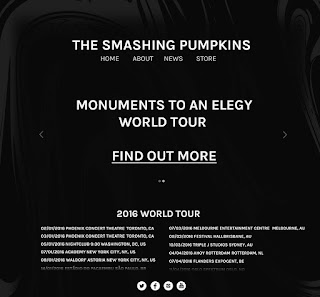
Finally, I created the weeks 5 - 8 part of the website. The first image that comes up on the slideshow will be a link to the iTunes website to buy the album. The comments section has been removed and replaced with tour dates. The second image that appears will give you more information on the tour by clicking the link by taking you to a page that lets you purchase tickets.


I mocked up this part of the website to show how it will scroll, similarly to the iMac: 


Once I had a solid desktop layout and aesthetic, I moved onto creating the mobile website. I found this quite easy to adapt to as I already created the wireframes.


I also inverted the tour poster to make it fit more with the theme and to be cohesive with the website. I feel its appropriate to have a tour poster along with the website campaign to appeal to the target audience. They are more used to tour posters and will probably appreciate a printed, physical deliverable to go feature with the campaign. The poster can also be uploaded to the bands social media pages to ensure a wide audience is reached. 


OUGD504 | STUDIO BRIEF 4 | WIREFRAMES

It was mentioned to me in the crit that we should be producing wireframes for our designs before we create the actual website. I've decided to do this before I start on any improvements, to give me a rough idea of what I want to do. This works well in industry, as it means you aren't spending a long time developing something, for the client to say that's not what they want, or you've missed a fundamental part of the concept out.

I want the website to be pretty cohesive throughout its 8 week span, before and after the launch. I used a software called balsamiq to create my wireframes. It was very simple to use, which helped me a lot in developing my website. I started with the website before the launch. Weeks 1 - 4 will be the same, as the only thing thats changing will be the clues. It was mentioned that it would be nice to visit previous clues when the website updates with a new one. I decided that having a slideshow as the main part of the homepage, where you can view the clues and also pre-order the new album.


The box with the cross in the middle indicates where the slideshow will be. Users will be able to click through them with arrows. Underneath, I've placed some text which will be where users can comment about the clue, and build hype on the website. This will keep the users coming back and checking to see if anyone has figured it out, or to engage in discussions. I think this will work well for my target audience, because many of them won't be active participants on social media. The comments will be left anonymous with no need to sign up to the website, as I feel this will just put people off commenting all together. There will be a feature to reply to other comments and engage in discussions. The comments section will work something similar to the app Yik Yak, where people post anonymous messages from around your area, and you can up or down vote them. Limiting the comments to the area wouldn't work for my project so I wont be including this feature, but keeping them anonymous and having a "most popular" section would work well here.

For the people that do use social media, and want to engage with the clues through there, I've added a pop up that will appear when you hover over the clue and click "share". The pop up will let you share the image of the clue to social media and you can comment on what you think this way. This also generates hype as people who don't know about the band may become intrigued.


Finally, the website will change on the 5th - 8th week of the campaign. The comments section will be removed, and replaced with tour dates. The slideshow will also change, and have a section to buy the album, then a section about the tour and a "find out more" button which will automatically scroll down to show the full tour dates, and give the user an option to buy tickets at the bottom.

For the mobile site, the information and style will be the same but it needs to be adapted for a smaller screen size. I used balsamiq again to create some wireframes for this. The mobile's weeks 1 - 8 will have the same structure as shown here:


When the user goes to comment on the website, the screen will have to change as the phone keyboard will appear. I have taken this into consideration and created a wireframe that will demonstrate how this will work: 


A simple box will appear to write the comment, and then you can choose to submit or close the box if this was a mistake.

To share the clue from your phone, you simply tap on the image and click "share", much like the desktop version. A pop up will appear and you select which social media icon you'd like to share this to:


The navigation on the mobile website will work via a hamburger icon at the top of the page. When you click it, the "Home, About, News and Store" buttons will appear. To close the navigation you simply click the icon again.


Friday 4 December 2015

OUGD504 | STUDIO BRIEF 4 | MOCKUPS AND CRIT

Once I had my aesthetic nailed down, I mocked up my ideas onto an actual computer.


This makes it look more realistic and its easier to visualise how the website will actually feel when its being used. I also started to mock up the mobile version, but didn't get very far with this as I'm not very experienced with mobile design:

I wanted to keep the liquified text in the background, and the clue should be the main part of the website,  but it didn't fit on correctly as the screen is much thinner. I decided to put part of the clue coming in from the left side where it cuts off on the right, although  I still have a lot of white space left with no information to fill it with. I added a bar at the side with a little arrow that lets you view the navigation of the website. This definitely needs more work, but I kept it like this to take into the crit, as I didn't want to put a lot of work into something that needs to be changed. 

These are the images I took into the crit along with the mockups:


Tour Poster

 Website after launch


 Week 1


 Week 2

Week 3

Week 4

The overall response was positive. I got some really good information about the actual process of building a website, including H1-H6 type sizes, the break point of screen sizes, aspect ratio and accessibility. 

The response to my concept was met with positivity, though people said that I could improve this by making it work with social media too. People could share the gif to their social media with their thoughts or if they've figured it out. It was also suggested that when each clue is added, it would be nice to see previous clues too. There should be a pre-order button for the new album somewhere on the main page as well. 

The aesthetic and layout was generally good, though small tweaks could be made to the size of the navigation and social media buttons. The liquified text could also be all around the edge of the page rather than in one corner, to make sure that the information is all central. 

Overall I'm pleased with this feedback, I felt like I had stagnated a little with this project and some fresh opinions has really helped. Now I can make some improvements to the site and hopefully engage the audience to the fullest. 

OUGD504 | STUDIO BRIEF 4 | FURTHER DEVELOPMENT

I decided to scrap the idea of using the sunshine, because I found it difficult to incorporate it into the website and the whole aesthetic wasn't working. I started experimenting with the gifs again, trying to make them as illegible as possible but still being able to make out what it's saying. I wanted the fans to engage with this and really think about what the website is telling you.

Obviously here the type is very legible. The movements are very flow-y and subtle. I decided to make this quite clear so that the user can tell what the album is actually called. I moved onto the 2nd week, making the clue for the coordinates.

This gif is more confusing than the first one, it has 4 sets of coordinates and only 1 is the correct set. The correct coordinates are for Chicago, where the band is from and where they played many of their first gigs. Dedicated fans of the band will research into the coordinates and will understand where the gig is going to be played.

This is a gif for the 3rd week which tells the user the date of the show in roman numerals. I'm still undecided whether this gif should be more distorted, and not have it easily readable at the beginning. I think the clues should be quite difficult to work out, but not impossible. 


The final clue is a lyric from one of their earlier songs, which reads "And the embers never fade in your city by the lake, the place where you were born". This lyric is about Chicago, and it will confirm any fans who already have suspicions about the clues. 

I began mocking these up on a website, striping it back and making it cleaner with an emphasis on using black and white only. I played around with the liquify tool while distorting the gifs, and I created a decorative element that could be used on all parts of the campaign. It was originally the album name in a bold typeface, and I think it looks effective coupled with the distorted gifs.


This would be website week 1. The new album name is displayed in the center of the main information, making it the focal point of the page. I mocked this up using the other gifs too and I feel this is a much better response to the original work that I created. The website is clean, easy to navigate and wont confuse my target audience, which would predominantly be 40-50 year old males. The younger audience would also be able to interact with the site through the social media links which are placed at the bottom of the page. 


I adapted the tour poster using the same process of liquifying the text and keeping it very minimal. The older audience will probably appreciate this more, as a physical element to the campaign is what they're more used to seeing and will look out for. 

Thursday 3 December 2015

OUGD504 | STUDIO BRIEF 4 | IDEA DEVELOPMENT

To start off this brief I decided to create a tour poster to nail down the aesthetic I wanted to go for. The album cover features a grungy looking wall, so I decided to play on this by using a similar style for the poster. I found a suitable wall with graffiti on it where I live, and settled on using this for my design.


The empty wall space and gives a good amount of room for text and information, while the sunshine is quite an iconic looking symbol for the tour. I played around with it on PhotoShop, making it black and white to fit with the grungy aesthetic of the existing artwork.


After this, I started adding information to it. The tour needs to be large as it's a worldwide tour, so I looked online and took dates from a previous world tour that they did in 1996. The font that I have used here is called Haettenschweiler, and it's appearance is very strong and impacting.

 I left a white border around the poster to make "The Smashing Pumpkins" look most important, and what your eye is drawn to first. I kept a theme of monochrome throughout the poster which can be associated with the original album artwork:


I tried to adapt this style to a website, using the same sunshine image but it was difficult to lay out to create a user friendly environment that also looks visually pleasing. I wanted to include gifs onto my main page that gave off a clue every week. I started to develop this, trying to keep the gif as hard to read as possible to make the user think: 


I made 2 versions, but decided to go for the white version in my final layout mockup but at a faster pace. This is the first layout that I created:


The main aim of this first page is to create hype among the fans. The image is there to create consistency between the poster and the website. I'm still unsure about the layout because it doesn't 
look like a traditional website, or really have anything that stands out to fans. I continued this style of layout with the other clues, changing the website as time went on to show that the site was developing with the lead up to the announcement. 


I changed the week 2 website to negative, then on the week 3 website the images were placed together to create what looks like a street corner. The gif on week 2 is coordinates flashing and changing each time, but only 1 coordinate is right, and is in the place of the secret gig (Chicago). The week 3 gif is the date of the secret gig (and also album launch), in roman numerals. This clue is probably the easiest to figure out, but I couldn't really think of any other way to make the audience think about the clue without it being too difficult to understand.