Saturday, 30 April 2016

OUGD505 | STUDIO BRIEF 1 | SOUTH AMERICA AND ASIA

The next designs I moved onto were South America and Asia, as I had a clear idea of what I wanted the UV design to look like. South America has had a lot of trouble with oil spills in recent years, and if we don't find suitable replacements for fossil fuels the risk of more spills will continue. Asia, particularly in China (and subsequently Japan), has problems with air pollution which is a large issue for its citizens health and wellbeing.

South America


An initial idea for this design incorporated a large part of the sea to show the effects of the oil spill, though the colours were difficult to get right and wouldn't translate well through printing.


This new preliminary design had the same layout as Antarctica, and looked more cohesive with the design, though looking from this angle meant the sun couldn't be included in this design. 

I took a different approach, including a palm tree and luscious mountains in the background to give the design more depth. This way, the sun, sea and greenery could all be included in a simple, well rounded design. 


Asia

Choosing an iconic location for Asia was quite difficult as the continent is extremely widespread and has many different cultures. 

I decided to go for a traditional looking Japanese building that enforced the Asian culture. I placed Mt Fuji in the background and left plenty of open space in the sky for the air pollution. The initial design had quite a lot of colours on it, and looked quite grey and bleak. 

I decided to remove the grasslands at the bottom of the design as the green was badly clashing with the red, and change the colour of the mountain to blue. 


Finally, there were still some more complex aspects of the design that could be removed for the ease of screen printing. The final design is shown here: 


OUGD505 | STUDIO BRIEF 1 | INITIAL SKETCHES AND DEVELOPMENT

To begin the project, I started drawing out some initial ideas for each continent that could also have a UV design printed over the top.


The initial ideas show how some of the scenes could be portrayed with certain disasters as a result of climate change. There's an oil spill, bush fire, extreme flooding and air pollution. It will be quite difficult to represent a complex scene due to limitations on colour and detail as the final resolution is screen printed. 

Moving onto the computer, the initial designs for Africa and Antarctica were created. 


A texture is created behind the scene using the name as the continent, though this would be tricky to represent through screen printing. Originally, each design was going to be 1 colour, but getting the detail in properly proved to be quite difficult. 

I felt that Antarctica wasn't represented properly, and the map was too detailed for the process. I decided to make a scene that was more about block colour shapes. 


The colour has changed to a cooler blue, representing the weather conditions. Under the UV light of this design, the iceberg will appear smaller, as though it's melted due to climate change. 


Further details were added into the design, including the sun which will feature in all of the designs to link them together. The amount of colours in this design will make it a longer screen printing process and create a larger risk, but I feel this gives the design more depth and interest. It also allows for a more interesting UV design. 


Wednesday, 27 April 2016

OUGD505 | STUDY TASK 3 | DISOBEDIENT OBJECTS NORTH

Brief:
You are asked to produce a simplistic flyer design for a 'Disobedient Objects North' Exhibition at the People's History Museum (www.phm.org.uk) using the instructions below.

Specifications:
Format: A5 – Portrait
Title: Disobedient Objects North
Sub-Title: In Association with the V&A
Date: August 3, 2015 - August 29, 2015
Location: People's History Museum, Manchester.
Contacts:
www.phm.org.uk
www.vam.ac.uk
Image: Single exhibit-based image, People's History Museum logo, V&A logo,
Use of two colours only: Black and white

Response:


Looking through the provided images, I thought that this was the most effective to use on a flyer. It's a stand-alone image that isn't too busy and grabs peoples attention with the bold text. The layout of the information works around the image. The title and subtitle are at the top of the page as the most important information on the flyer. Other information such as date and location are at the bottom left, so if people are still interested they can read this too.


Brief:
You are to layout and design a 10-page concertina folded brochure for a forthcoming exhibition titled ‘Disobedient Objects North’ at People's History Museum, Manchester. All images, copy and branding are included. You have to create a visually stimulating layout that showcases the artists’ imagery but does not sacrifice important information in this process. The images and information must flow harmoniously and offer a taste of what is to be expected during the exhibition. One further consideration may be whether you emphasise the 'North' aspect: whether the materials need to offer a distinction between this and the V&A (London) exhibition from 2014-2015.
Branding elements must be kept to black and white. Images must be unaltered and in colour.

Considerations:
Headings, headlines, body copy, grid, type, colour, image sizing, bleed, margins, flow, audience, narrative, language, purpose, size, external print methods, preparing for print, stock, distribution.
Specifications:
Format: A5 x10 – Portrait – Concertina spread (front and back).
Title: Disobedient Objects North
Sub-Title: In Association with the V&A
Date: August 5, 2016 - August 31, 2016
Location: People’s History Museum, Left Bank, Spinningfields, Manchester, M3 3ER, United Kingdom

Response:


The concertina design makes use of images from the exhibition as well as all of the supporting text. The text is laid out in columns to make it easier for the viewer to read. Bright colours were used throughout the concertina, to represent social boundaries being broken and the triangles bring in extra energy to the design.


Monday, 25 April 2016

OUGD505 | STUDY TASK 2 | BEETLEJUICE

This study task was to help us generate ideas in a more interesting, thought provoking way. We were given the task to promote consumption of bugs to people in the UK.

Our initial ideas are shown here:


We narrowed these ideas down to two potential roots, party food and exercise supplements. We came up with more ideas for each of these: 


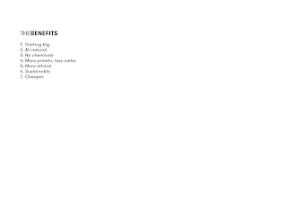
We decided to go with an exercise brand, as we thought people who were serious about muscle gain wouldn't care what they consumed. We branded our supplements as Beetlejuice, that create shakes, bars, supplements and apparel. 


We thought it was appropriate to make a presentation showing how our brand would look and what the concept was. 


I found this study task extremely useful, and it's given me a lot to think about when generating my own ideas! We came up with quite an abstract concept that was different to anyone else in the class.


Thursday, 14 April 2016

OUGD503 | MODULE EVALUATION

The responsive module has been a really great module to explore different types of briefs. My practice has developed throughout this module and I’ve felt that responding to briefs that are similar to industry level has improved my skills as a designer.

Choosing which briefs to respond to has highly improved my level of work, as I could decide what would suit my style the most. I wanted to create vibrant, fun designs and portray my personality through my work. Responsive has allowed me to do this and apply it to other projects that I have been working on.

Throughout this module I’ve developed a personal style and felt comfortable when creating work. I’ve also taken the oppertunity to submit to competitions seriously and tried to create work that I was not only proud of, but I thought had a chance of winning. The YCN Feel Good Drinks brief was the substantial brief I undertook for Individual Practice. It was a brief that allowed me to be experimental, not giving set deliverables and encouraged creativity. I felt this really opened up my practice and led me to create a resolution that met the targets set by Feel Good, but also work that I was really happy with. 

The smaller briefs in Individual Practice allowed me to work quickly and produce work that was mostly aesthetically driven. Secret 7 was a very liberating brief in the module as it didn’t need a concept as much as the other projects. This was one of the briefs I enjoyed the most as I could design something simply driven by how it looks. 

Collaborative Practice showed me what it was like to work with creatives from other fields. We chose Adobe as it was a brief that fit all of our creative talents and let us all contribute equally to the project. As we work very differently, it was difficult to get timings right and create a fully polished piece. It was interesting to see the process of different creatives throughout this module, and working together we met the deadline. Though I wasn’t extremely happy with the outcome, collaborative practice has given me an insight of how to work with other creatives and how to manage time within a group. It also widened my experiences and allowed me to work with a really talented group of people. 

Reflecting on this module, I feel I could have improved on my initial idea generation and research. I didn’t pursue any other ideas once I had settled which could limit my final idea. Sometimes this was due to the time restriction of the briefs, e.g. Secret 7. Generating other ideas and capitalising on a few is something I will work on in further modules. This also means that I could organise my time better, ensuring I have enough time to work on other ideas and develop them appropriately. 


Overall I felt the module has been extremely beneficial to my design practice as a whole. It was very exciting to take part in so many competition briefs and create work that could potentially win. Responsive ignited passions within design that I never knew I had, e.g. packaging design and children's design, both of which I’m looking forward to pursuing in the future. I also have goals to work towards in future modules which will help improve my practice as a whole.